Rough.js, an implementation of the work published in Wood et al. (2012).
By the end of this chapter you should gain the following knowledge and practical skills.
Uncertainty is a key preoccupation of those working in statistics and data analysis. A lot of time is spent providing estimates for it, reasoning about it and trying to take it into account when making evidence-based claims and decisions. There are many ways in which uncertainty can enter a data analysis and many ways in which it can be conceptually represented. This chapter focuses mainly on parameter uncertainty: quantifying and conveying the different possible values that a quantity of interest might take. It is straightforward to imagine how visualization can support this. We can use data graphics to represent different values and give greater emphasis to those for which we have more certainty – to communicate or imply levels of uncertainty in the background. Such representations are nevertheless quite challenging to execute. In Chapter 3 we learnt that there is often a gap between the visual encoding of data and its perception. There is a tendency in standard data graphics to imbue data with marks that over-imply precision. We will consider research in Cartography and Information Visualization on uncertainty representation, before exploring and applying techniques for visually encoding parameter uncertainty. We will do so using STATS19 road safety data, exploring how injury severity rates in pedestrian-vehicle crashes vary over time and by geographic area.
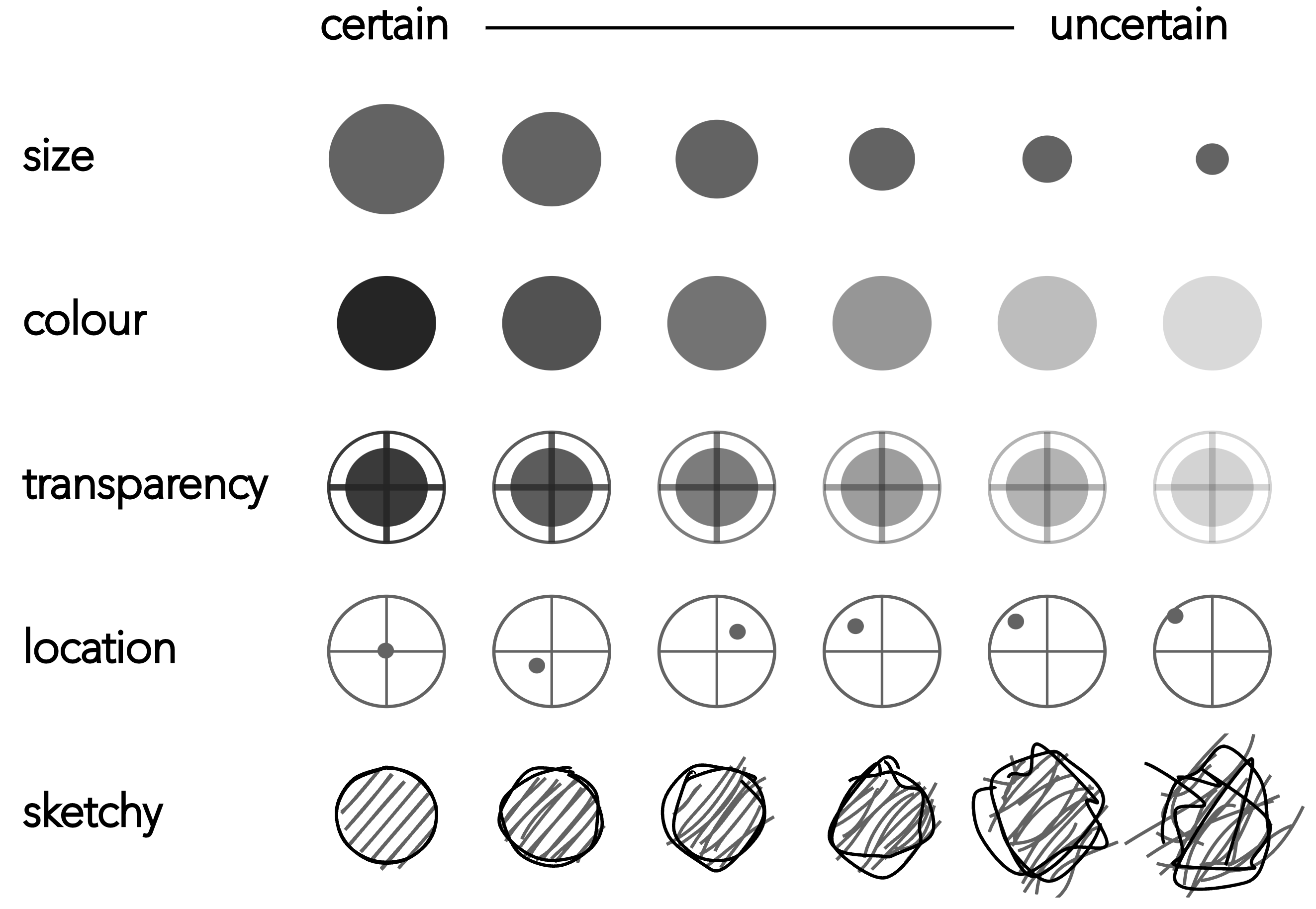
Cartographers and Information Visualization researchers have been concerned for some time with visual variables, or visual channels (Munzner 2014), that might be used to encode uncertainty information. Figure 7.1 displays several of these. Ideally, visual variables should be intuitive, logically related to notions of precision and accuracy, while also allowing sufficient discriminative power when deployed in data dense visualizations.
Rough.js, an implementation of the work published in Wood et al. (2012).
Kinkeldey, MacEachren, and Schiewe (2014) provides an overview of empirical research into the effectiveness of proposed visual variables against these criteria. As intuitive signifiers of uncertainty, or lack of precision, fuzziness (not encoded in Figure 7.1) and location have been shown to work well. Slightly less intuitive, but nevertheless successful in terms of discrimination, are size, transparency and colour value. Sketchiness is another intuitive signifier proposed in Boukhelifa et al. (2012). As with many visual variables, sketchiness is probably best considered as an ordinal visual variable to the extent that there is a limited range of sketchiness levels that can be discriminated. An additional feature of sketchiness is its sense of informality. This may be desirable in certain contexts, less so in others (see Wood et al. 2012 for further discussion).
When thinking about uncertainty visualization, a key guideline is that:
Things that are not precise should not be encoded with symbols that look precise.
Much discussed in recent literature on uncertainty visualization (e.g. Padilla, Kay, and Hullman 2021) is the US National Weather Service’s (NWS) (NHC 2023) cone graphic (Figure 7.2 (a)). The cone starts at the storm’s current location and spreads out to represent the modelled projected path of the storm. The main problem is that the cone implies the storm is expanding as it moves away from its current location, when this is not the case. In fact there is more uncertainty in the areas that could be affected by the storm the further away those areas are from the storm’s current location. The second problem is that the cone uses strong lines that imply precision. The temptation is to think that anything contained by the cone is unsafe and anything outside of it is safe. This is of course not what is suggested by the model. Rather, that areas not contained by the cone are beyond some chosen threshold probability. You will notice that the graphic in Figure 7.2 (a) is annotated with a guidance note to discourage such false interpretation.


In Van Goethem et al.’s (2014) redesign, colour value is used to represent four binned categories of storm probability suggested by the model. Greater visual saliency is therefore conferred to locations where there is greater certainty. The state boundaries are also encoded somehwat differently. In Figure 7.2 (b) US states are symbolised using a single line generated via curve schematisation (Van Goethem et al. 2014). The thinking here is that hard lines in maps tend to induce binary judgements. If the cone is close to but not overlapping a state boundary, for example, should a state’s authorities prepare and organise a response any differently from a state whose boundary very slightly overlaps the cone? Context around states is therefore introduced in the redesign, but in a way that discourages binary thinking; precise inferences of location are not possible as the state areas and borders are very obviously not exact.
For practical reasons the rest of the chapter considers how these general principles for uncertainty representation might be applied to a single aspect of uncertainty: quantifiable parameter uncertainty. Parameters of interest are often probabilities or relative frequencies – ratios and percentages describing the probability of some event happening. It is notoriously difficult to develop intuition around these sorts of relative frequencies, and so data graphics can usefully support their interpretation.
In our STATS19 road crash dataset, a parameter of interest is the pedestrian injury severity rate, or the proportion of all pedestrian crashes that result in serious or fatal injury (KSI). We might wish to compare the injury severity rate of crashes taking place between two local authority areas, say Bristol and Sheffield. There is in fact quite a difference in the injury severity rate between these two local authorities. In 2019, 35 out of 228 reported crashes (15%) in Bristol were KSI, while for Sheffield this figure was 124 out of 248 reported crashes (50%). This feels like quite a large difference, but it is difficult to imagine or experience these differences in probabilities when written down or encoded visually using relative bar length in standardised bar charts.
Icon arrays are used in public health communication and have been demonstrated to be effective at communicating probabilities of event outcomes. They offload the thinking that happens when evaluating ratios. The icon arrays in Figure 7.3 communicate the two injury severity rates for Bristol and Sheffield. Each crash is a square, and crashes are coloured according to whether they resulted in a serious injury or fatality (dark red) or slight injury (light red). In the bottom row, cells are given a non-random ordering to effect something similar to a standardised bar chart. While the standardised bars enables the two recorded proportions to be “read-off” (15% and 50% KSI), the random arrangement of cells in the icon array perhaps builds intuition around the differences in probabilities of a pedestrian crash resulting in serious injury.
There are compelling examples of icon arrays being used in data journalism, most obviously to communicate outcome probabilities in political polling. You might remember that at the time of the 2016 US Presidential election there was much criticism levelled at pollsters, even the excellent FiveThirtyEight (Silver 2016), for not correctly calling the result. Huffpost gave Trump a 2% chance of winning the election, The New York Times 15% and FiveThirtyEight 28%. Clearly the Huffpost estimate was really quite off, but thinking about FiveThirtyEight’s prediction, how surprised should we be if an outcome that is predicted to happen with a probability of almost a third, does in fact occur?
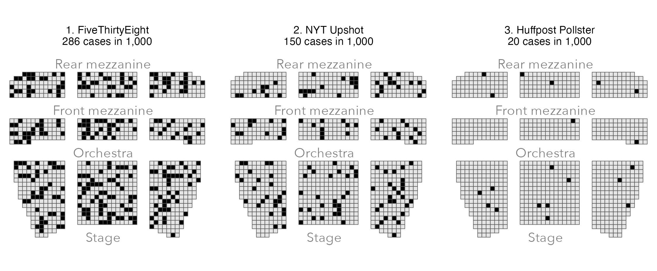
The risk theatre (Figure 7.4) is a variant of an icon array. In this case it represents polling probabilities as seats of a theatre – a dark seat represents a Trump victory. If you imagine buying a theatre ticket and being randomly allocated to a seat, how confident would you be about not sitting in a “Trump” seat in the FiveThirtyEight image? The distribution of dark seats suggests that the 28% risk of a Trump victory according to the model is not negligible.
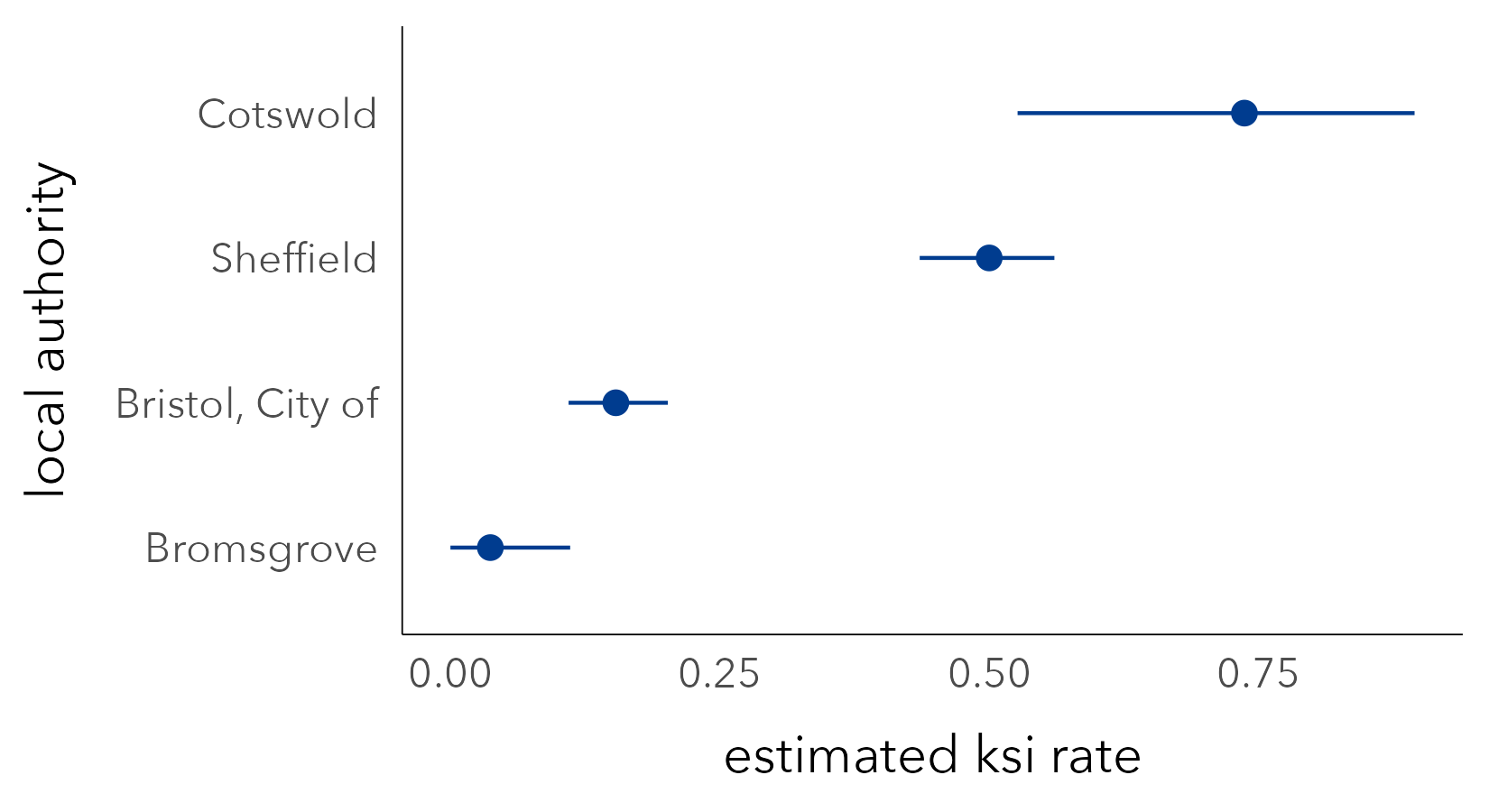
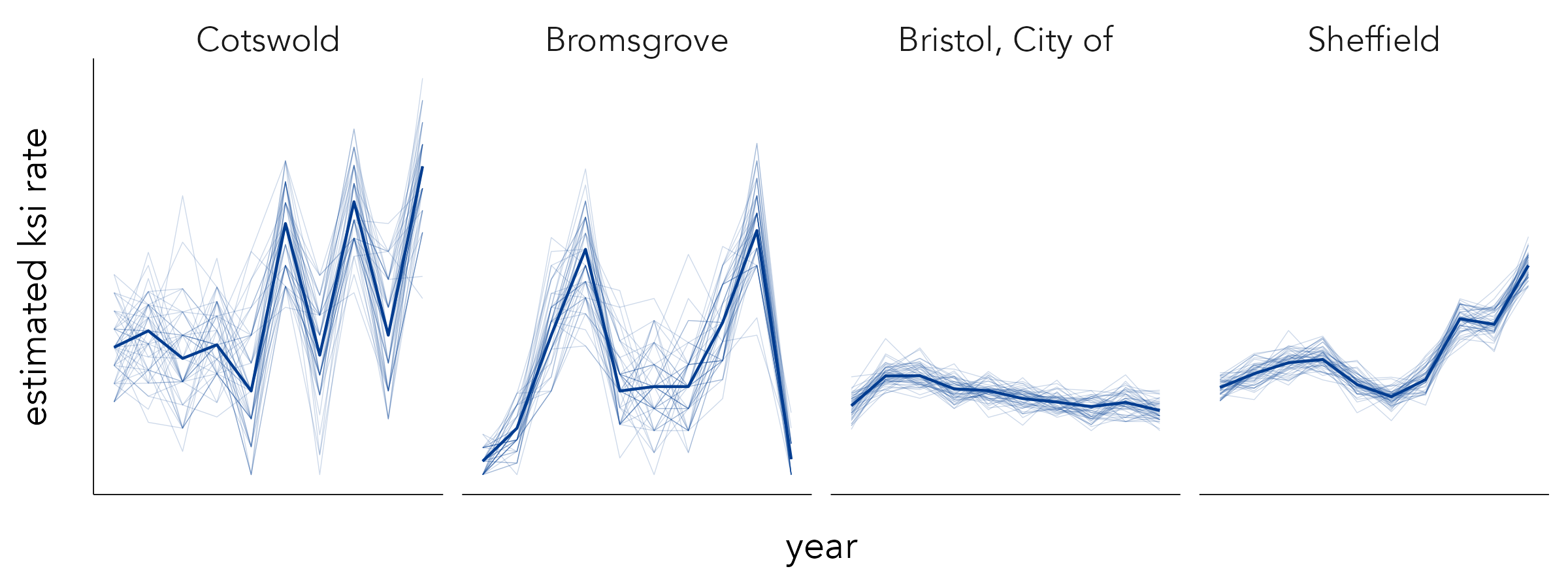
In the icon arrays above we made little of the fact that the sample size varies between the two recorded crash rates. This was because the differences were in fact reasonably small. When looking at injury severity rates across all local authorities in the country, however, there is substantial variation in the rates and sample sizes. Bromsgrove has a very low injury severity rate based on a small sample size (4%, or one out of 27 crashes resulting in KSI); Cotswold has a very high injury severity rate based on a small sample size (75%, or 14 out of 19 crashes resulting in KSI). With some prior knowledge of these areas one might expect the difference in KSI rates to be in this direction, but would we expect the difference to be of this order of magnitude? Just three more KSIs recorded in Bromsgrove takes its KSI rate up to that of Bristol’s.
Although STATS19 is a population dataset to the extent that it contains data on every crash recorded by the police, it makes sense that the more data on which our KSI rates are based, the more certainty we have in them being reliable estimates of injury severity – ones that might be used to predict injury severity in future years. So we can treat our observed injury severity (KSI) rates as being derived from samples of an (unobtainable) population. Our calculated KSI rates are parameters that try to represent, or estimate, this population.
Although this formulation might seem unnecessary, from here we can apply some statistical concepts to quantify uncertainty around our KSI rates. We assume:
In Chapter 6 we used Confidence Intervals to estimate the uncertainty around regression coefficients. From early stats courses you might have learnt how Confidence Intervals can be calculated using statistical theory, but we can derive them empirically via bootstrapping – the process enumerated above. So a bootstrap resample involves taking a random sample with replacement from the original data and of the same size as the original data. From this resample a parameter estimate can be derived, in this case the KSI rate. And this process can be repeated many times to generate an empirical sampling distribution for the parameter. The standard error can be calculated from the standard deviation of the sampling distribution. This non-parametric bootstrapping approach is especially useful in exploratory analysis (Beecham and Lovelace 2023): it can be applied to many sample statistics, makes no distributional assumptions and can work on quite complicated sampling designs.
Presented in Figure 7.5 are KSI rates with error bars used to display 95% Confidence Intervals generated from a bootstrap procedure in which 1000 resamples were taken with replacement. Upper and lower limits were lifted from .025 and .975 percentile positions of the bootstrap sampling distribution. Assuming that the observed data are drawn from a wider (unobtainable) population, the 95% Confidence Intervals demonstrate that while Cotswold recorded a very large KSI rate, sampling variation means that this figure could be much lower (or higher), whereas for Bristol and Sheffield, where our KSI rate is derived from more data, the range of plausible values that the KSI rate might take due to sampling variation is much smaller – there is less uncertainty associated with their KSI rates.
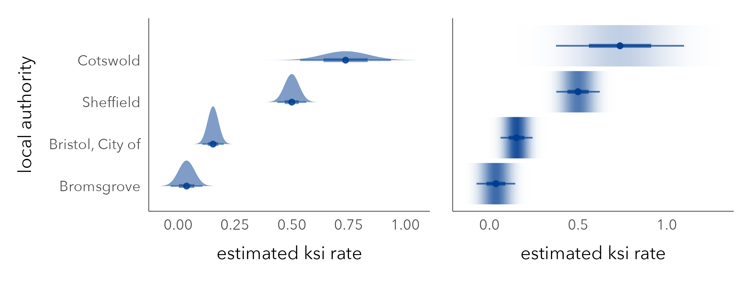
Error bars, like those in Figure 7.5, are a space-efficient way of conveying parameter uncertainty. However, remembering our main guideline for uncertainty visualization – that things that are not precise should not be encoded with symbols that look precise – they do have problems. The hard borders can lead to binary or categorical thinking (see Correll and Gleicher 2014). Certain values within a Confidence Interval are more probable than others, and so we should endeavour to use a visual encoding that reflects this. Matt Kay’s excellent ggdist package (Kay 2024) extends ggplot2 with a range of chart types for representing these sorts of intervals. In Figure 7.6 error bars are replaced by half eye plots and gradient bars, which give greater visual saliency to values of KSI that are more likely.
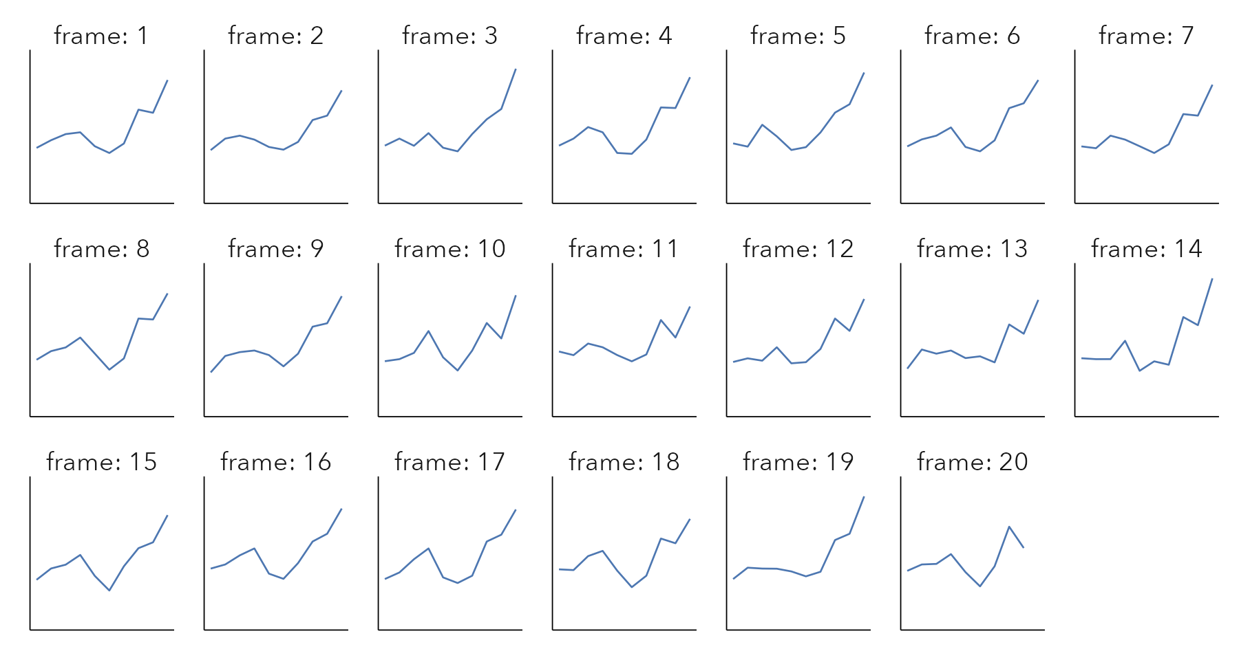
STATS19 road crash data are released annually. Given the wide uncertainty bands for some local authorities, it might be instructive to explore the stability of KSI rates year-on-year. In Figure 7.5 these KSI rates are represented with a bold line, and the faint lines are superimposed bootstrap resamples. The lines demonstrate volatility in the KSI rates for Cotswold and Bromsgrove due to small numbers. The observed increase in KSI rates for Sheffield since 2015 does appear to be a genuine one, although may also be affected by uncertainty around data collection and how reliably injury severity is recorded in the dataset.
The superimposed lines in the figure above are a form of ensemble visualization. An alternative approach might have been to animate over the bootstrap resamples to generate a Hypothetical Outcome Plot (HOP) (Hullman, Resnick, and Adar 2015). HOPs convey a sense of uncertainty by animating over random draws of a distribution. As there is no single outcome to anchor to, HOPs force viewers to account for uncertainty, recognising that some less probable outcomes may also be possible – essentially to think distributionally.
In road safety monitoring, a common ambition is to compare crash rates across local authorities. This is in order to make inferences around patterns of high and low injury severity rate. We might represent injury severity rates as Risk Ratios (RR) comparing the observed injury severity rate in each local authority to a benchmark, say the injury severity rate we would expect to see nationally. RRs are an intuitive measure of effect size: RRs >1.0 indicate that the injury severity rate is greater than the national average; RRs <1.0 that it is less than the national average. As they are a ratio of ratios, and therefore agnostic to sample size, RRs can nevertheless be unreliable. Two ratios might be compared that have very different sample sizes, and no compensation is made for the one that contains more data.
We can use quantitative measures to adjust for this. In the example in Figure 7.9 we use hierarchical modelling to shrink local authority KSI rates towards the global mean (national average KSI rate) where they are based on small numbers of observations (see Beecham and Lovelace 2023). From here our effect sizes, called Bayesian Risk Ratios, are sensitive to uncertainty since they are made more conservative where they are based on fewer observations. The Bayesian Risk Ratio for each local authority is represented with a | icon: angled to the right / where the KSI rate is greater than expected, to the left \ where it is less than expected. Additionally, we use bootstrap resampling to derive confidence intervals for our Bayesian RRs. If this interval does not cross 1.0, the RR is judged statistically significant and is coloured according to whether estimated RRs are above (/) or below (\) expectation.
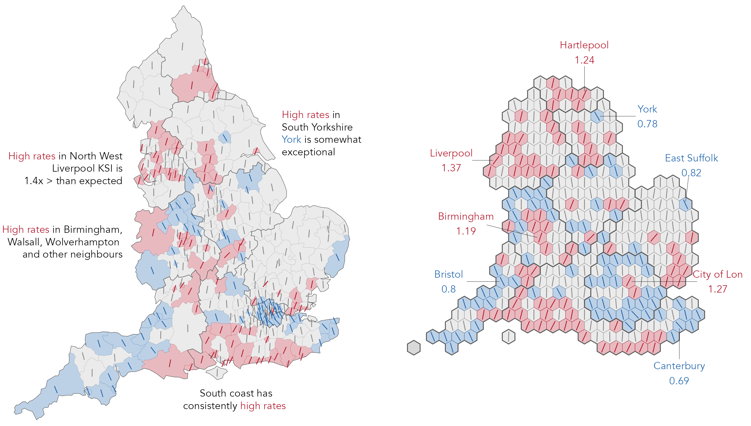
From Figure 7.9 we make inferences around concentrations of high and low injury severity rate (in the annotations). A problem with this approach, and explicitly encoding ‘statistical significance’ values, is one familiar to statisticians but that is rarely addressed in visual data analysis: the multiple comparison problem. Whenever a statistical signal is identified, there is a chance that the result observed is in fact a false alarm. In the plot above which uses a 95% confidence level, the “false positive rate” is expected to be 5% or 1/20. When many tests are considered simultaneously, as in Figure 7.9, the number of these false alarms begins to accumulate. There are corrections that can be used to address this: test statistics can be adjusted and made more conservative. But these corrections have consequences. Too severe a correction can result in statistical tests that are underpowered and result in an elevated false negative rate, where a statistical test fails to detect an effect that truly exists. See Brunsdon and Charlton (2011) for an interesting discussion in the context of mapping crime rates.
So there is no single solution to multiple testing, which happens often in visual data analysis, especially in Geography, where health and other outcomes are mapped visually. It is actually less of problem in Figure 7.9 since our RRs are derived from a multilevel model in which estimates are partially pooled, or shrunk, to reflect the level of information we have (Gelman, Hill, and Yajima 2012). Presenting the RRs in their spatial context, and providing full information around RRs that are not significant (the oriented lines), also supports informal calibration. For example, depending on the phenomena, we may wish to attach more certainty to RRs that are labelled statistically significant and whose direction is consistent with their neighbours than those that are exceptional from their neighbours. Additionally, constructing a graphical line-up test (Wickham et al. 2010) allows us to explore whether the sorts of spatial patterns in RR values in the observed data are genuine or might appear in random decoy maps. Although informal, this sort of visual test approximates to the type of question that transport analysts may ask when identifying priority areas for road safety intervention (Beecham and Lovelace 2023).
The technical element demonstrates how some of the uncertainty estimate examples in the chapter can be reproduced. We will again make use of functional programming approaches via the purrr package, mostly for generating and working over bootstrap resamples.
07-template.qmd1 file for this chapter, it to your vis4sds project.vis4sds project in RStudio, and load the template file by clicking File > Open File ... > 07-template.qmd.The template file lists the required packages: tidyverse, sf, tidymodels (for working with the bootstraps), ggdist and distributional for generating plots of parameter uncertainty and gganimate for the hypothetical outcome plot. Code for loading the STATS19 pedestrian crash data is in the 07-template.qmd file.
Icon arrays can be generated reasonably easily in standard ggplot2 using geom_tile() and some data generation functions. The most straightforward approach is to place icon arrays in a regularly-sized grid. In the example, KSI rates in Fareham (41%) and Oxford (17%) are compared.
First we generate the array data: a data frame of array locations (candidate crashes) with values representing whether the crash is slight or KSI depending on the observed KSI rate. In the code below, we set up a 10x10 grid of row and column locations and populate these with values for the selected local authorities (Oxford and Fareham) using base R’s sample() function.
The plot code is straightforward:
Plot specification:
pivot_longer() so that we can facet by local authority. geom_tile() for drawing square icons.scale_fill_manual() is supplied with values that are dark (KSI) and light (slight) red.facet_wrap() for faceting on local authority. geom_tile(colour="#ffffff", size=1)).
To present the icon array as a risk theatre, we have created a shapefile containing 1,000 theatre seat positions. To randomly allocate KSIs to seats on the proportion in which those crashes occur, we use the slice_sample() function.
theatre_cells <- st_read(here("data", "theatre_cells.geojson"))

ksi_seats <- bind_rows(
  theatre_cells |> slice_sample(n=170) |>
    add_column(la="Oxford\n170 KSI in 1,000 crashes"),
  theatre_cells |> slice_sample(n=410) |>
    add_column(la="Fareham\n410 KSI in 1,000 crashes")
)
The code:
theatre_cells |>
  ggplot() +
  geom_sf() +
  geom_sf(
    data=ksi_seats,
    fill="#000000"
  ) +
  annotate("text", x=23, y=1, label="Stage", alpha=.5) +
  annotate("text", x=23, y=21, label="Orchestra", alpha=.5) +
  annotate("text", x=23, y=31, label="Front mezzanine", alpha=.5) +
  annotate("text", x=23, y=42, label="Rear mezzanine", alpha=.5) +
  facet_wrap(~la)
Plot specification:
theatre_cells contains geometry data for all 1,000 seats; ksi_seats contains the randomly sampled seat locations.geom_tile() for drawing seat icons.facet_wrap() for faceting on local authority.fill="#000000"). Also annotate() blocks of the theatre, x- and y- placement is determined via trial-and-error.The code for generating bootstrap resamples, stored in rate_boots, initially looks formidable. It is a template that is nevertheless quite generalisable, and so once learnt can be extended and applied to suit different use cases.
rate_boots <- ped_veh |>
  mutate(
    is_ksi=accident_severity!="Slight",
    year=lubridate::year(date)
  ) |>
  filter(year==2019,
         local_authority_district %in% c("Bristol, City of",
        "Sheffield", "Bromsgrove", "Cotswold")
  ) |>
  select(local_authority_district, is_ksi) |>
  nest(data=-local_authority_district) |>
  mutate(la_boot=map(data, bootstraps, times=1000, apparent=TRUE)) |>
  select(-data) |>
  unnest(la_boot) |>
  mutate(
    is_ksi=map(splits, ~analysis(.) |>  pull(is_ksi)),
    ksi_rate=map_dbl(is_ksi, ~mean(.x)),
    sample_size=map_dbl(is_ksi, ~length(.x))
  ) |>
  select(-c(splits, is_ksi))
Code description:
mutate() is straightforward – a binary is_ksi variable identifies whether a crash is KSI, and the crash year is extracted from the date variable. Crashes recorded in 2019 are then filtered, along with the four comparator local authorities. To generate bootstrap resamples for each local authority, we nest() on local authority. You will remember that nest() creates a special type of column (a list-column) in which the values of the column is a list of data frames – in this case the crash data for each local authority. So running the code up to and including the nest(), a data frame is returned which contains four rows corresponding to the filtered local authorities and a list-column called data, each element of which is a data frame of varying dimensions (lengths) depending on the number of crashes recorded in each local authority.mutate() that follows, purrr’s map() function is used to iterate over the list of datasets and the bootstraps() function to generate 1,000 bootstrap resamples for each nested dataset. The new column, la_boot, is a list-column this time containing a list of bootstrap datasets.unnest() the la_boot column to return a dataset with a row for each bootstrap resample and a list-column named splits which contains the bootstrap data. Again we map() over each element of splits to calculate the ksi_rate for each of the bootstrap datasets. The first call to map() extracts the is_ksi variable; the second is just a convenient way of calculating a rate from this (remembering that is_ksi is a binary variable); the third collects the sample size for each of the bootstraps, which of course is the number of crashes recorded for each local authority.With ggdist, the code for generating KSI rates with estimates of parameter uncertainty is straightforward and very similar to the error bar plots in the previous chapter.
Plot code:
Plot specification:
rate_boots data frame is grouped by local authority and in the mutate() we calculate an estimate of bootstrap standard error, the standard deviation of the sampling distribution, and filter all rows where id=="Apparent" – this contains the KSI rate for the observed (unsampled) data.stat_gradientinterval(), the ggdist function for producing gradient plots.stat_gradientinterval() for drawing the gradients and point estimates.coord_flip() for easy reading of local authority names.To generate bootstrap resamples on local authority and year, necessary for the year-on-year analysis, we can use the same template as that for calculating rate_boots; the only difference is that we select() and nest() on the year as well as the local_authority_district column.
rate_boots_temporal <- ped_veh |>
  ...
  ... |>
  select(local_authority_district, is_ksi, year) |>
  nest(-c(local_authority_district, year)) |>
  ...
  ...
  ...
The ensemble plot is again reasonably straightforward:
Plot specification:
rate_boots_temporal data frame. Note that we include two line layers, one with the observed data (data=. %>% filter(id=="Apparent") and one with the bootstrap data (data=. %>% filter(id!="Apparent").geom_line() for drawing lines.facet_wrap() for faceting on local authority.alpha and size channels very small.Finally, the Hypothetical Outcome Plot (HOP) can be created easily using the gganimate package, simply by adding a call to transition_states() at the end of the plot specification:
rate_boots_temporal |>
  filter(id!="Apparent") |>
  ggplot(aes(x=year, y=ksi_rate)) +
  geom_line(aes(group=id), linewidth=.6) +
  facet_wrap(~local_authority_district)+
  transition_states(id, 0,1)
Uncertainty is fundamental to any data analysis. Statisticians and data scientists almost always end up reasoning about uncertainty, developing quantitative estimates of uncertainty and communicating uncertainty so that it can be taken into account when making evidence-based claims and decisions. Through an analysis of injury severity in the STATS19 road crash dataset, this chapter introduced techniques for quantifying and visually representing parameter uncertainty. There has been much activity in the Information Visualization and Data Journalism communities focussed on uncertainty communication – on developing approaches that promote intuition and allow users to experience uncertainty. We have covered some of these and demonstrated how they could be incorporated into our road crash analysis case study.
An excellent primer on uncertainty visualization:
On visualizing parameter uncertainty:
Correll, M. and Gleicher, M. 2014. “Error Bars Considered Harmful: Exploring Alternate Encodings for Mean and Error,” IEEE Transactions on Visualization and Computer Graphics 20(12): 2142–2151. doi: 10.1109/TVCG.2014.2346298.
Kale, A., Nguyen, F., Kay, M. and Hullman, J. 2019. “Hypothetical Outcome Plots Help Untrained Observers Judge Trends in Ambiguous Data,” IEEE Transactions on Visualization and Computer Graphics, 25(1): 892–902. doi: 10.1109/TVCG.2018.2864909.
On bootstrap resampling with R and tidyverse:
https://vis4sds.github.io/vis4sds/files/07-template.qmd↩︎