| Measurement type | Statistic | Chart type |
|---|---|---|
| Within-variable variation | ||
| Nominal | mode | entropy | bar charts, dot plots ... |
| Ordinal | median | percentile | bar charts, dot plots ... |
| Continuous | mean | variance | histograms, box plots, density plots ... |
| Between-variable variation | ||
| Nominal | contingency tables | mosaic/spine plots ... |
| Ordinal | rank correlation | slope/bump charts ... |
| Continuous | correlation | scatterplots, parallel coordinate plots ... |
4 Exploratory Data Analysis
By the end of this chapter you should gain the following knowledge and practical skills.
4.1 Introduction
Exploratory Data Analysis (EDA) is an approach that aims to expose the properties and structure of a dataset, and from here suggest analysis directions. In an EDA relationships are quickly inferred, anomalies are labelled, models are suggested and evaluated. EDA relies heavily on visual approaches to analysis; it is common to generate many dozens of often throwaway data graphics when exploring a dataset for the first time.
This chapter demonstrates how the concepts and principles introduced previously, of data types and their visual encoding, can be applied to support EDA. It does so by analysing STATS19, a dataset containing detailed information on every reported road traffic crash in Great Britain that resulted in personal injury. STATS19 is highly detailed, with many categorical variables. The chapter starts by revisiting commonly used chart types for analysing within-variable variation and between-variable co-variation in a dataset. It then focuses more directly on the STATS19 case, and how detailed comparison across many categorical variables can be effected using colour, layout and statistical computation.
4.2 Concepts
4.2.1 Exploratory data analysis and statistical graphics
In Exploratory Data Analysis (EDA), graphical and statistical summaries are used to build knowledge and understanding of a dataset. The goal of EDA is to infer relationships, identify anomalies and test new ideas and hypotheses. Rather than a formal set of techniques, EDA should be considered a sort of outlook to analysis. It aims to reveal properties, patterns and relationships in a dataset, and from there expectations, codified via models, to be further investigated in context via more targeted data graphics and statistics.
The early stages of an EDA may be very data-driven. Datasets are described abstractly according to their measurement level and corresponding data graphics and summary statistics generated from these descriptions (e.g. Table 4.2 ). As knowledge and understanding of the dataset increases, researchers might apply more targeted theory and prior knowledge when developing and evaluating models.
Visual approaches play an important role in both these stages of analysis. For example, when first examining variables according to their shape and location, data graphics help identify patterns that statistical summaries miss, such as whether variables are multi-modal, the extent and direction of outliers. When more specialised models are proposed, graphical summaries can add important detail around where, and by how much, the observed data depart from the model. It is for this reason that data visualization is seen as intrinsic to EDA (Tukey 1977).
4.2.2 Plots for continuous variables
Within-variable variation
Figure 4.1 presents statistical graphics that are commonly used to show variation in continuous variables measured on a ratio and interval scale. In this instance, the graphics summarise the age of pedestrians injured (casualty_age) for a random sample of recorded road crashes.

In the left-most column is a strip-plot. Every observation is displayed as a dot and mapped to y-position, with dots horizontally perturbed and made a little transparent. Although strip-plots scale poorly, the advantage is that all observations are displayed without needing to impose some aggregation. It is possible to visually identify the ‘location’ of the distribution – denser dots towards the youngest ages (c.20 years) – but also that there is spread across the age values.
Histograms partition observations into equal-range bins, and observations in each bin are counted. These counts are encoded on an aligned scale using bar length. Increasing the number of the bins increases the resolution of the graphical summary. If reasonable decisions are made around choice of bin, histograms give distributions a shape that is expressive. It is easy to identify the location of a distribution, to see that it is uni- bi- or multi-modal. Different from the strip-plot, the histogram shows that despite the heavy spread, the distribution of casualty_age is right-skewed, and we’d expect this given the location of the mean (36 years) relative to the median (30 years).
A problem with histograms is the potential for discontinuities and artificial edge-effects around the bins. Density plots overcome this and can be thought of as smoothed histograms. They show the probability density function of a variable – the relative amount of probability attached to each value of casualty_age. From glancing at the density plots, an overall shape to the distribution can be immediately derived. It is also possible to infer statistical properties – the mode of the distribution, the peak density, the mean and median – by a sort of visual averaging and approximating the midpoint of the area under the curve.
Finally, boxplots (McGill and Larsen 1978) encode these statistical properties directly. The box is the interquartile range (IQR) of the casualty_age variable, the vertical line splitting the box is the median, and the whiskers are placed at observations \leq 1.5*IQR. While we lose important information around the shape of a distribution, boxplots are space-efficient and useful for comparing many distributions at once.
Inequalities in who-hit-whom (by age)
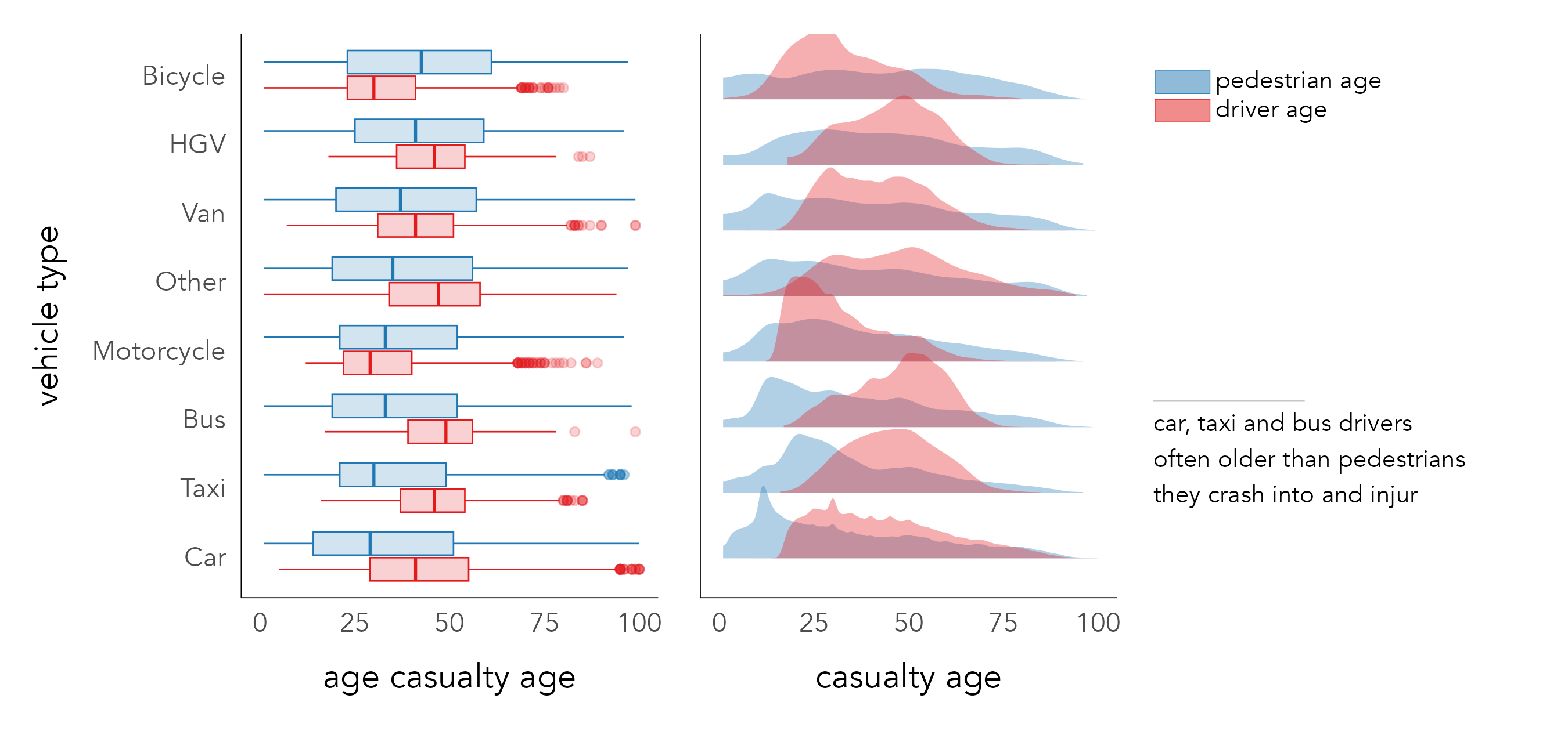
Since the average age of pedestrian road casualties is surprisingly low, it may be instructive to explore the distribution of casualty_age conditioning on another variable differentiated using colour. Figure 4.2 displays boxplots and density plots of the location and spread in casualty_age by vehicle and individual for all crashes involving pedestrians. A noteworthy pattern is that riders of bicycles and motorcycles tend to be younger than the pedestrians they collide with, whereas for buses, taxis, HGVs and cars the reverse is true.
Between-variable variation
The previous chapter included several scatterplots for exploring associations in electoral voting behaviour. Scatterplots are used to check whether the association between variables is linear, but also to make inferences about the direction and intensity of linear correlation between variables – the extent to which values in one variable depend on the values of another – and the nature of variation between variables – the extent to which variation in one variable depends on another. In an EDA it is common to quickly compare associations between many quantitive variables in a dataset using scatterplot matrices or, less often, parallel coordinate plots. There are few variables in the STATS19 dataset measured on a continuous scale, but in Chapter 6 we will use both scatterplot matrices and parallel coordinate plots when building models that attempt to structure and explain between-variable covariation, again on an electoral voting dataset.
4.2.3 Plots for categorical variables
Within-variable variation
For categorical variables, within-variable variation is judged on how relative frequencies distribute across the variable’s categories. Bar charts are commonly used, as bar length is effective at encoding frequency. When analysing variation across several categories, it is useful to flip bar charts on their side so that category labels can be easily scanned and, unless there is a natural ordering, arrange the bars in descending order based on their frequency. This is demonstrated in Figure 4.3, which shows the frequencies with which different vehicles types are involved in pedestrian casualties.

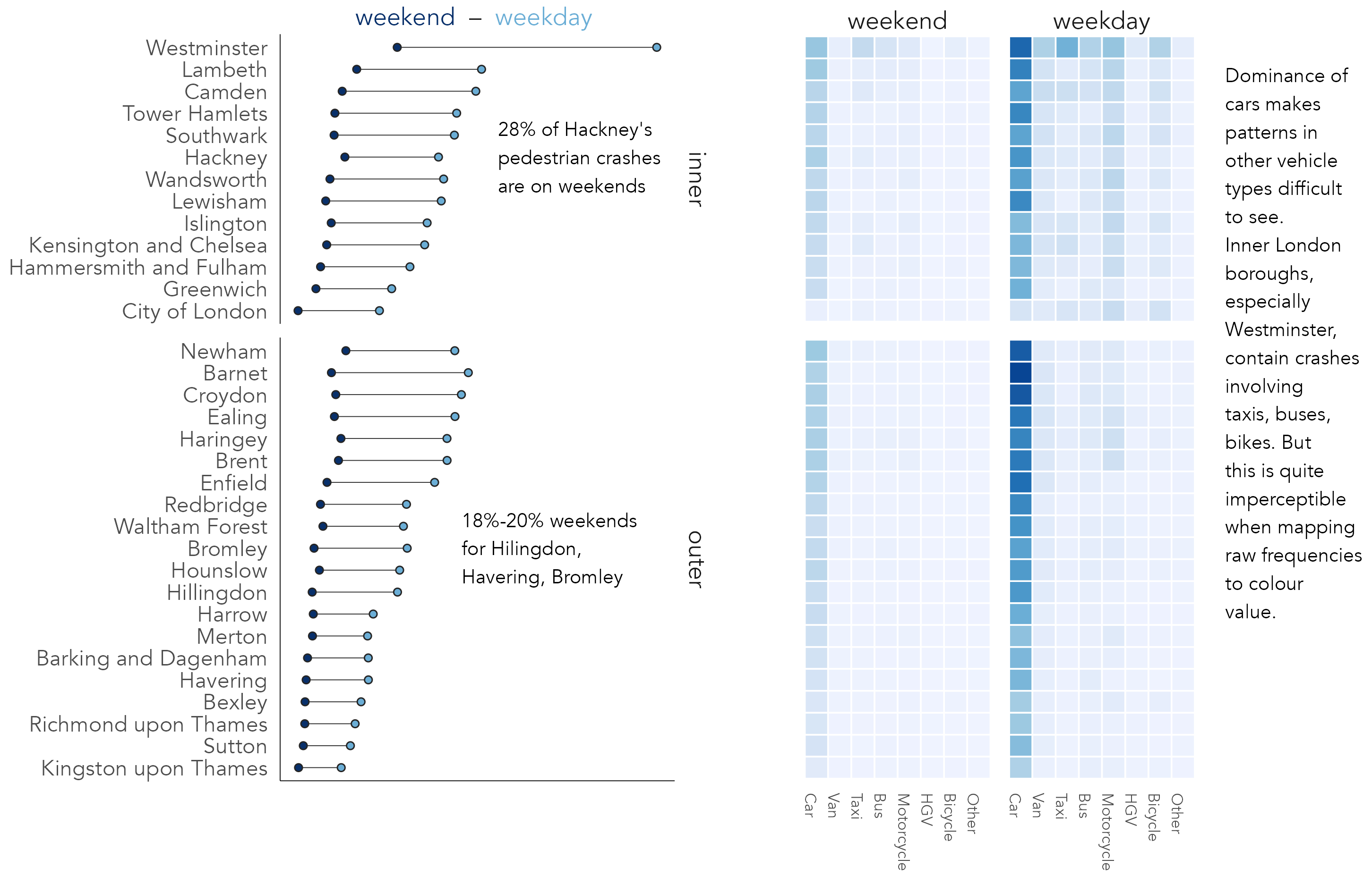
For summarising frequencies across many categories alternative chart types that minimise non-data-ink (Tufte 1983), such as dot plots, may be appropriate. The left plot in Figure 4.4 displays pedestrian crash counts for boroughs in London, ordered by crash frequency, grouped by whether boroughs are in inner- or outer- London and coloured on whether crashes took place on weekdays or weekends. Lines connecting dots emphasise the differences in absolute numbers between time periods. Although a consistent pattern is of greater crash counts during weekdays, the gap is less obvious for outer London boroughs; there may be relatively more pedestrian crashes occurring in central London boroughs during weekdays. The second graphic is a heatmap with the same ordering and grouping of boroughs, but with columns coloured according to crash frequencies by vehicle type, further grouped by weekday and weekend times. Remembering Munzner’s (2014) ordering of visual channels, we trade-off some precision in estimation when encoding frequencies in heatmaps. A greater difficulty, irrespective of encoding channel, comes from the dominance of cars and weekdays; variation between vehicle types and time periods outside of this is almost imperceptible.
Between-variable covariation: standardised bars and mosaic plots
In Figure 4.4 we began to make between-category comparison; we asked whether there are relatively more or fewer crashes by time period or vehicle type in certain boroughs than others. There are chart types that explicitly support these sorts of analysis tasks. Figure 4.5 compares pedestrian crash frequencies in London by vehicle type involved and whether the crash occurred on weekdays or weekends.
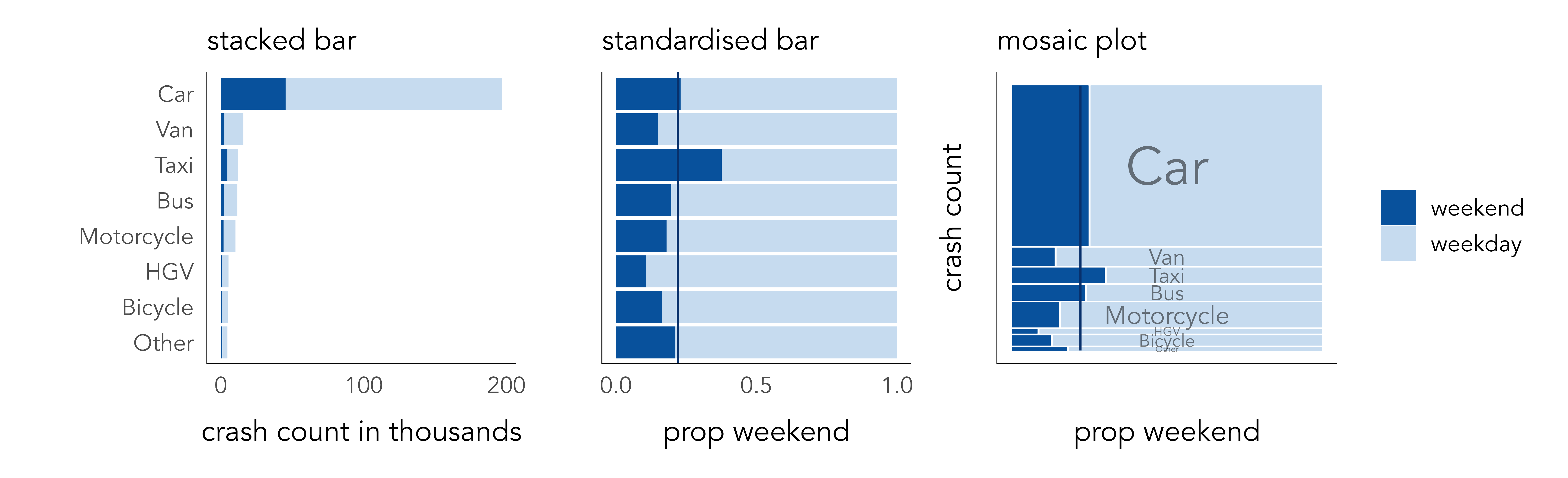
First, stacked bars are ordered by frequency, distinguishing time period using colour lightness. Cars are by far the dominant travel mode, contributing the largest number of crashes resulting in injury to pedestrians. Whether or not pedestrian injuries involving cars occur more on weekends than other modes is not clear from the left-most chart. Length encodes absolute crash counts effectively but relative comparison on time periods between vehicle types is challenging. In standardised bars the absolute length of bars is fixed, and bars are split according to proportional weekday / weekend crashes (middle). The plot is also annotated according to the expected proportion of weekday crashes if crashes occurred by time period independently of vehicle type (22%). This encoding shows pedestrian crashes involving taxis occur more than would be expected at weekends, while the reverse is true of crashes involving vans, bikes and HGVs. However, we lose a sense of the absolute numbers involved.
Failing to encode absolute number – the amount of information in support of some observed pattern – is a problem in EDA. Since proportional summaries are agnostic to sample size, they can induce false discoveries, overemphasising patterns that may be unlikely to replicate in out-of-sample tests. It is sometimes desirable, then, to update standardised bar charts so that they are weighted by frequency: to make more visually salient those categories that occur more often and visually downweight those that occur less often. This is possible using mosaic plots (Friendly 1992; Jeppson and Hofmann 2023). Bar widths and heights are allowed to vary, so bar area is proportional to absolute number of observations, and bars are further subdivided for relative comparison across category values. Mosaic plots are useful tools for exploratory analysis. That they are space-efficient and regularly sized also means they can be flexibly laid out for comparison.
ggmosaic
The mosaic plot in Figure 4.5 was generated using the ggmosaic package, an extension to ggplot2 (Jeppson and Hofmann 2023).
Encoding variation from expectation
The heatmap in Figure 4.4 is hampered by the dominating effect of cars and weekdays. Any additional structure by time period and vehicle type in boroughs outside of this is visually unintelligible. An alternative approach could be to colour cells according to some relevant effect size statistic: for example, differences in the proportion of weekend crashes occurring in any vehicle-type and borough combination against the global average proportion, or expectation, of 22% of crashes occurring on weekends. A problem with this approach is that at this more disaggregated level, sample sizes become quite small. Large proportional differences could be encoded that are nevertheless based on negligible differences in absolute crash frequencies.
There are measures of effect size sensitive both to absolute and relative differences from expectation. Signed chi-score residuals (Visvalingam 1981), for example, represent expected values as counts separately for each category combination in a dataset – in this case, pedestrian crashes recorded in a borough in a stated time period involving a stated vehicle type. Observed counts (O_i ... O_n) are then compared to expected counts (E_i ... E_n) as below:
\chi=\frac{O_i - E_i}{\sqrt{E_i}}
The way in which differences between observed and expected values (residuals) are standardised in the denominator is important. If the denominator was simply the raw expected value, the residuals would express the proportional difference between each observation and its expected count value. The denominator is instead transformed using the square root (\sqrt{E_i}), which has the effect of inflating smaller expected values and squashing larger expected values, thereby adding saliency to differences from expectation that are also large in absolute number.
Figure 4.6 updates the heatmaps with signed residuals encoded using a diverging colour scheme (Brewer and Campbell 1998) – red for cells with greater crash counts than expected, blue for cells with fewer crash counts than expected. The assumption in the first heatmap is that crash counts by borough distribute independently of vehicle type. Laying out the heatmap such that inner and outer London boroughs are grouped for comparison is instructive: fewer than expected crashes in inner London are recorded for cars; greater than expected for all other vehicle types but especially taxis and bicycles. This pattern is strongest (largest residuals) for very central boroughs, where pedestrian crash frequencies are also likely to be highest and where cars are comparatively less dominant as a travel mode. For almost all boroughs, again especially central London boroughs, there is a clear pattern of modes other than cars, taxis and buses overrepresented amongst crashes occurring on weekdays, again reflecting the transport dynamics of the city.

4.2.4 Strategies for supporting comparison
A key role for data graphics in EDA is in supporting comparison. Three strategies typically deployed are juxtaposition, superposition and explicit encoding (see Gleicher et al. 2011). Table 4.4 defines each and identifies how they can be implemented in ggplot2. You will see these implementations being deployed in different ways as the book progresses.
| Strategy | Function | Use |
|---|---|---|
| Juxtaposition | faceting | Create separate plots in rows and/or columns by conditioning on a categorical variable. Each plot has same encoding and coordinate space. |
| Juxtaposition | patchwork cowplot pkg | Flexibly arrange plots of different data type, encoding and coordinate space. |
| Superposition | geoms | Layering marks on top of each other. Marks may be of different data types but must share the same coordinate space. |
| Explicit encoding | NA | No strategy specialised to explicit encoding. Often variables cross 0, so diverging schemes, or graphics with clearly annotated and symbolised thresholds are used. |
As with most visualization design, each involves trade-offs , and so careful decision-making. In Figure 4.4 dotplots representing counts of weekend and weekday crashes are superposed on the same coordinate space, with connecting lines added to emphasise difference. This strategy is fine where two categories of similar orders of magnitude are compared, but if instead all eight vehicle types were to be encoded with categories differentiated using colour hue, the plot would be substantially more challenging to process. In Figure 4.6, comparison by vehicle type is instead effected using explicit encoding – residuals coloured above or below an expectation. Notice also the use of containment, juxtaposition and layout in both plots. By containing frequencies for inner- and outer- London boroughs in separate juxtaposed plots, and within each laying out cells top-to-bottom on frequency, the systematic differences in the composition of vehicle types involved in crashes between inner- and outer- London can be inferred.
Comparison and layout
Layout is an extremely important mechanism for enabling comparison. The heatmaps in Figure 4.6, for example, would be much less effective were some default alphabetical ordering of boroughs used. This applies especially when exploring geography. Spatial relations are highly complex and notoriously difficult to model. It would be hard to imagine how the sorts of comparisons in the Washington Post graphics in the previous chapter (Figure 3.1 and Figure 3.5) could be made without using graphical methods, laying out the peak and line marks with a geographic arrangement in this case.
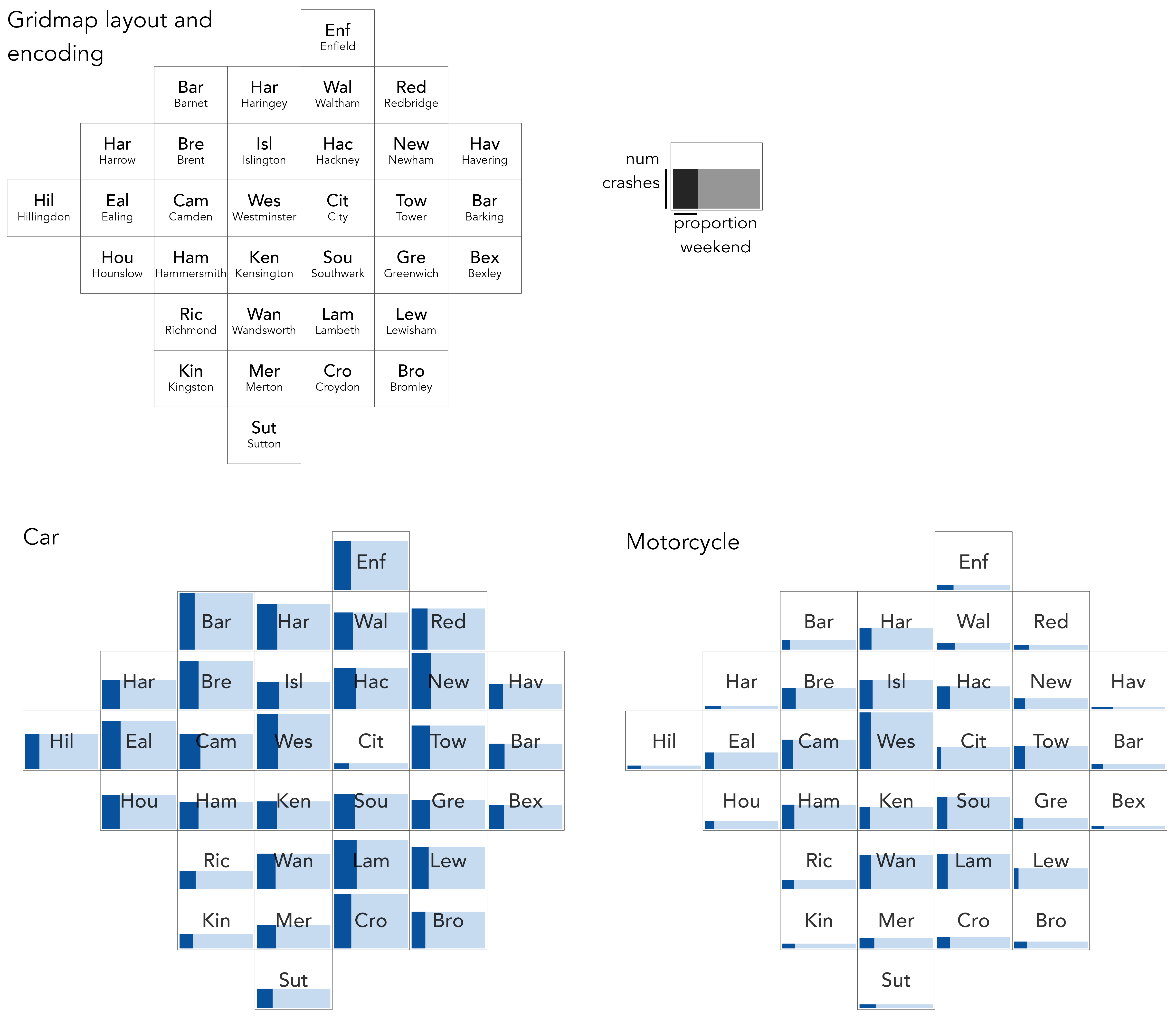
Figure 4.7 borrows the earlier mosaic plot design to study crash frequencies (bar height) and relative number of weekday/weekend crashes (dark bar width), with frequencies compared between London boroughs. Rather than laying out boroughs top-to-bottom on frequency, boroughs are given an approximate spatial arrangement. This is generated using the gridmappr (Beecham 2024) R package, which we describe and explore properly in Chapter 5. This arrangement enables several patterns to be quickly inferred. We can observe that pedestrian crashes involving motorcycles generally occur more in central London boroughs; those involving cars occur in greater relative number during weekends, especially so for those in central London boroughs; and, different from other vehicle types, pedestrian crashes involving cars occur in similarly large numbers in outer London boroughs (Barnet, Croydon) as they do inner London boroughs such as Westminster.
4.3 Techniques
The technical element to this chapter continues with the STATS19 dataset. Rather than a how-to guide for generating exploratory analysis plots in R, the section aims to demonstrate a workflow for exploratory visual data analysis:
- Expose pattern(s)
- Model expectation(s) derived from pattern(s)
- Show deviation from expectation(s)
It does so by exploring the characteristics of individuals involved in pedestrian crashes, with a special focus on inequalities. Research suggests those living in more deprived neighbourhoods are at elevated risk of road crash injury than those living in less-deprived areas (Tortosa et al. 2021). A follow-up question is around the characteristics of those involved in crashes: To what extent do drivers share demographic characteristics with the pedestrians they crash into, and does this vary by the location in which crashes take place?
4.3.1 Import
- Download the
04-template.qmd1 file for this chapter, and save it to yourvis4sdsproject. - Open your
vis4sdsproject in RStudio, and load the template file by clickingFile>Open File ...>04-template.qmd.
The presented analysis is based on that published in Beecham and Lovelace (2023) and investigates vehicle–pedestrian crashes in STATS19 between 2010 and 2019, where the Index of Multiple Deprivation (IMD) class of the pedestrian, driver and crash location is recorded. Raw STATS19 data are released by the Department for Transport, but can be accessed via the stats19 R package (Lovelace et al. 2019). The data are organised into three tables:
-
Accidents (or Crashes): Each observation is a recorded road crash with a unique identifier (
accident_index), date (date), time (time) and location (longitude,latitude). Many other characteristics associated with the crashes are also stored in this table. -
Casualties: Each observation is a recorded casualty that resulted from a road crash. The Crashes and Casualties data can be linked via the
accident_indexvariable. As well ascasualty_severity(Slight,Serious,Fatal), information on casualty demographics and other characteristics is stored in this table. -
Vehicles: Each observation is a vehicle involved in a crash. Again Vehicles can be linked with Crashes and Casualties via the
accident_indexvariable. As well as the vehicle type and manoeuvre being made, information on driver characteristics is recorded in this table.
An .fst dataset that uses these three tables to record pedestrian crashes with associated casualty and driver characteristics has been stored in the book’s accompanying data repository2.
4.3.2 Sample
The focus of our analysis is inequalities in the characteristics of those involved in pedestrian crashes. There is only high-level information on these characteristics in the STATS19 dataset. However, the Index of Multiple Deprivation (Noble et al. 2019) quintile of the small area neighbourhood in which casualties and drivers live is recorded, and we have separately derived the IMD quintile of the neighbourhood in which crashes took place.
Not all recorded crashes contain this information, and we first create a new dataset – ped_veh_complete – identifying those linked crashes where the full IMD data are recorded:
The dataset contains c. 52,600 observations, 23% of linked pedestrian crashes. Although this is a large number, there may be some systematic bias in the types of pedestrian crashes for which full demographic data are recorded. For brevity we will not extensively investigate this bias, but below ‘record completeness rates’ are calculated for selected crash types. As anticipated, lower completeness rates appear for crashes coded as Slight in injury severity, but there are also lower completeness rates for crashes occurring in the highest deprivation quintile.
| Crash category | Completeness rate |
|---|---|
| Casualty severity | |
| Fatal | 30% |
| Serious | 29% |
| Slight | 22% |
| IMD class of crash location | |
| 5 Least deprived | 25% |
| 4 Less deprived | 25% |
| 3 Mid deprived | 24% |
| 2 More deprived | 23% |
| 1 Most deprived | 22% |
This difference in record completeness may reflect genuine differences in recording behaviour for crashes occurring in high deprivation neighbourhoods, or it might be a function of some confounding context. For example, one might expect crashes more serious in nature to be reported in greater detail and so have higher completeness rates. If crashes resulting in slight injuries are overrepresented in high deprivation areas, this might explain the pattern of completeness rates by deprivation area. To explore this further, in Figure 4.8 completeness rates are calculated separately by crash injury severity. This demonstrates, as expected, higher completeness rates for crashes resulting in more serious injury, but that record completeness is still lower for crashes taking place in the high deprivation neighbourhoods.
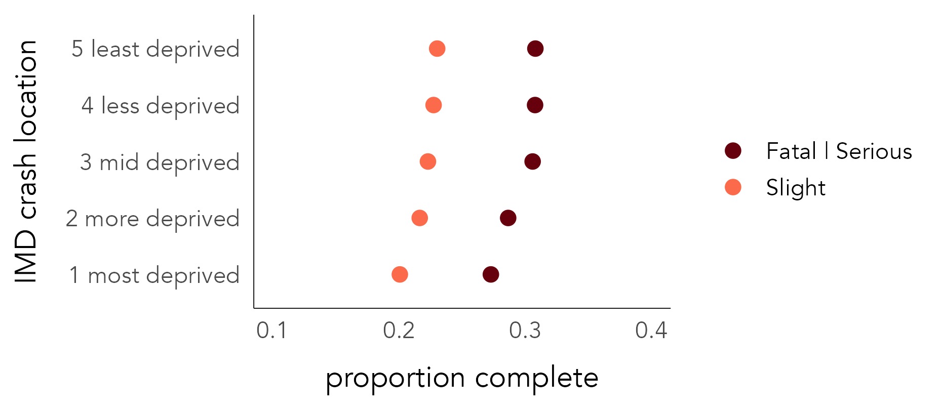
The code for Figure 4.8:
ped_veh |>
  mutate(
    is_complete=accident_index %in% (ped_veh_complete |> pull(accident_index)),
    is_ksi=if_else(accident_severity != "Slight", "Fatal | Serious", "Slight")
  ) |>
  group_by(crash_quintile, is_ksi) |>
  summarise(prop_complete=mean(is_complete)) |>
  ggplot() +
  geom_point(
    aes(y=crash_quintile, x=prop_complete, colour=is_ksi), size=2
    ) +
  scale_colour_manual(values=c("#67000d", "#fb6a4a")) +
  scale_x_continuous(limits=c(0.1,.4))
A breakdown of the ggplot2 code:
-
Data: A Boolean variable,
is_complete, is defined by checkingaccident_indexagainst those contained in theped_veh_completedataset. Note that thepull()function extractsaccident_indexfrom the complete dataset as a vector of values. A Boolean variable (is_ksi) groups and separates Fatal and Serious injury outcomes from those that are Slight. We then group oncrash_quintileandis_ksito calculate completeness rates by severity and crash location. Sinceis_completeis a Boolean value (false=0,true=1), its mean is the proportion oftruerecords, in this case those with a complete status. -
Encoding: Arrange dots vertically (
yposition) oncrash_quintileand horizontally (xposition) onprop_completeandcolouron injury severity (is_ksi). -
Marks:
geom_point()for drawing points. -
Scale: Passed to
scale_colour_manual()are hex values for dark and light red, according to ordinal injury severity.
4.3.3 Abstract and relate
Now that we’ve identified the data for our analysis, we can begin to explore the dataset, bearing in mind the ultimate “who-hit-whom” question: Do drivers share demographic characteristics with the pedestrians they crash into, and does this vary by the location in which crashes take place?
To start, we abstract over the relevant variables: five IMD classes from high-to-low deprivation (IMD quintile 1–5) for pedestrians, drivers, and crash locations. Figure 4.9 summarises frequencies across these categories. Pedestrian crashes occur more frequently in higher deprivation neighbourhoods; those injured more often live in higher deprivation neighbourhoods; and the same applies to drivers involved in crashes. This high-level pattern is consistent with existing research (Tortosa et al. 2021) and can be explained. High deprivation areas are located in greater number in urban areas, and so we would expect greater numbers of pedestrian crashes to occur in such areas. The shapes of the bars nevertheless suggest that there are inequalities in the characteristics of pedestrians and drivers involved in crashes: frequencies are most skewed towards high deprivation bars for pedestrians and are slightly more uniform across deprivation classes for drivers. This may indicate an importing effect of drivers living in lower deprivation areas crashing into pedestrians living in higher deprivation areas – a speculative finding worth exploring.

The code for Figure 4.9:
ped_veh_complete |>
  select(crash_quintile, casualty_quintile, driver_quintile) |>
  pivot_longer(
    cols=everything(), names_to="location_type", values_to="imd"
    ) |>
  group_by(location_type, imd) |>
  summarise(count=n()) |> ungroup() |>
  separate(col=location_type, into="type", sep="_", extra = "drop") |>
  mutate(
    type=case_when(
      type=="casualty" ~ "pedestrian",
      type=="crash" ~ "location",
      TRUE ~ type),
    type=factor(type, levels=c("location", "pedestrian", "driver"))
  ) |>
  ggplot() +
  geom_col(aes(x=imd, y=count), fill="#003c8f") +
  scale_x_discrete(labels=c("most","", "mid", "", "least")) +
  facet_wrap(~type)
The ggplot2 code:
-
Data: Select the three variables recording IMD class of crash location (
crash_quintile), pedestrian (casualty_quintile) and driver (driver_quintile).pivot_longer()makes each row a crash record and IMD class; this dataset is then grouped in order to count frequencies of location, pedestrian and drivers by IMD class involved.mutate()is used to recode thetypevariable with more expressive labels for locations, pedestrians and drivers and to convert it to a factor in order to control the order in which variables appear in the faceted plot. -
Encoding: Bars positioned vertically (
yposition) on frequency and horizontally (xposition) onimdclass. -
Marks:
geom_col()for drawing bars. -
Facets:
facet_wrap()for faceting on thetypevariable (location, pedestrian or driver).
4.3.4 Model and residual: Pass 1
To investigate how the characteristics of pedestrians and drivers co-vary, we can compute the joint frequency of each permutation of driver-pedestrian IMD quintile group. This results in 5x5 combinations, as in the right of Figure 4.9, and in Figure 4.10 these combinations are represented in a heatmap. Cells of the heatmap are ordered left-to-right on the IMD class of pedestrian and bottom-to-top on the IMD class of driver. Arranging cells in this way encourages linearity in the association to be emphasised. The darker blues in the diagonals demonstrate that an association between pedestrian-driver IMD characteristics exists: drivers and passengers living in similar types of neighbourhoods are involved in crashes with one another with greater frequency than those living in different types of neighbourhoods.
A consequence of the heavy concentration of crash counts, and thus colour, in the high-deprivation cells is that it is difficult to gauge variation and the strength of association in the lower deprivation cells. We can use exploratory models to support our analysis. In this case, our (unsophisticated) expectation is that crash frequencies distribute independently of the IMD class of the pedestrian-driver involved. We compute signed chi-scores describing how different the observed number of crashes in each cell position is from this expectation.
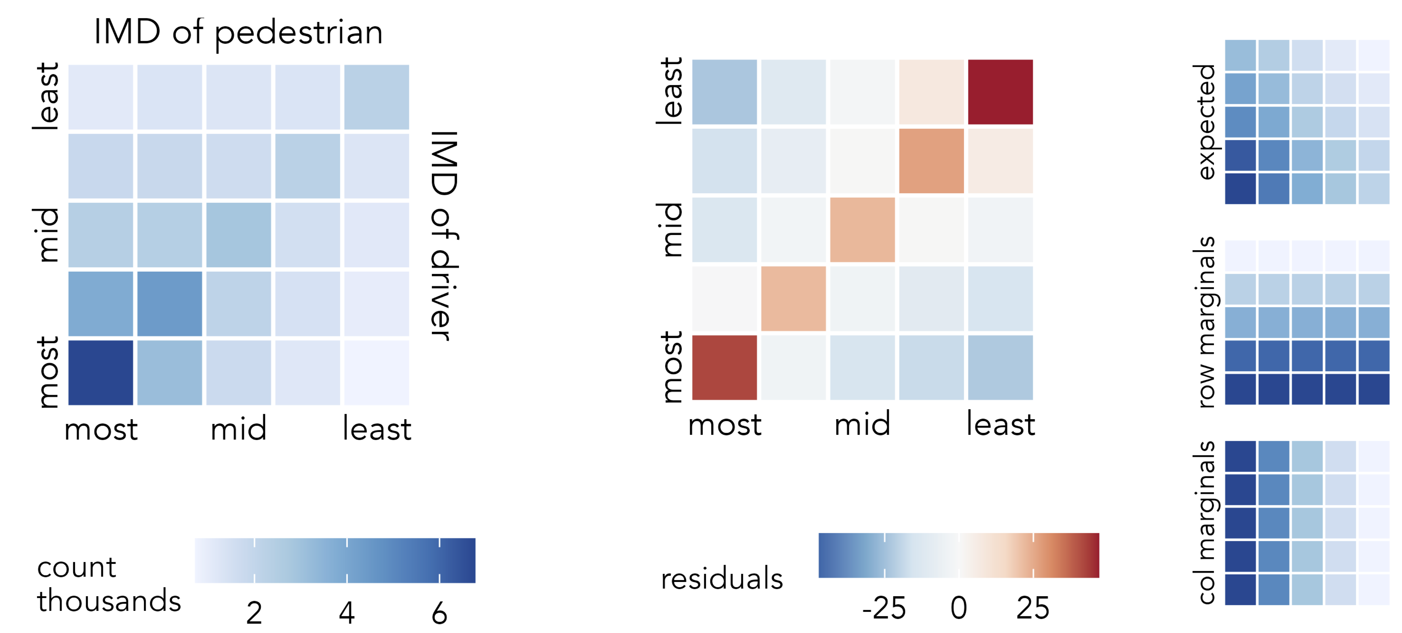
The observed-versus-expected plot highlights the largest positive residuals are in the diagonals and the largest negative residuals are those furthest from the diagonals: we see higher crash frequencies between drivers and pedestrians living in the same or similar IMD quintiles and fewer between those in different quintiles than would be expected given no association between pedestrian-driver IMD characteristics. That the bottom left cell – high-deprivation-driver + high-deprivation-pedestrian – is dark red can be understood when remembering that signed chi-scores emphasise effect sizes that are large in absolute as well as relative number. Not only is there an association between the characteristics of drivers and casualties, but larger crash counts are recorded in locations containing the highest deprivation and so residuals here are large. The largest positive residuals are nevertheless recorded in the top right of the heatmap – and this is more surprising. Against an expectation of no association between the IMD characteristics of drivers and pedestrians, there is a particularly high number of crashes between drivers and pedestrians living in neighbourhoods containing the lowest deprivation. An alternative phrasing: the IMD characteristics of those involved in pedestrian crashes are most narrow between drivers and pedestrians who live in the lowest deprivation quintiles.
The code:
model_data <- ped_veh_complete |>
  mutate(grand_total=n()) |>
  group_by(driver_quintile) |>
  mutate(row_total=n()) |> ungroup() |>
  group_by(casualty_quintile) |>
  mutate(col_total=n()) |> ungroup() |>
  group_by(casualty_quintile, driver_quintile) |>
  summarise(
    observed=n(),
    row_total=first(row_total),
    col_total=first(col_total),
    grand_total=first(grand_total),
    expected=(row_total*col_total)/grand_total,
    resid=(observed-expected)/sqrt(expected),
  )

max_resid <- max(abs(model_data$resid))

model_data |>
  ggplot(aes(x=casualty_quintile, y=driver_quintile)) +
  geom_tile(aes(fill=resid), colour="#707070", size=.2) +
  scale_fill_distiller(
    palette="RdBu", direction=-1,
    limits=c(-max_resid, max_resid)
    ) +
  coord_equal()
The ggplot2 spec for Figure 4.10:
-
Data: We create a staged dataset for plotting. Observed values for each cell of the heatmap are computed, along with row and column marginals for deriving expected values. We assume that crash frequencies distribute independently of IMD class, and so calculate expected values for each cell of the heatmap (E_{ij}) from its corresponding column (C_i), row (R_j) maginals and the grand total of crashes (GT): E_i = \frac{C_i \times R_i}{GT}. The graphics in the right margin of Figure 4.10 show how expectation is spread in this way. You will notice that
group_by()does some heavy lifting to arrive at these row, column and cell-level totals. The way in which the signed chi-score residuals are calculated in the finalgroup_by()follows that described earlier in the chapter. -
Encoding: Cells of the heatmap are arranged in
xandyon the IMD class of pedestrians and drivers and filled according to signed chi-score residuals. . -
Marks:
geom_tile()for drawing cells of the heatmap. -
Scale:
scale_fill_distiller()for continuous ColorBrewer (Harrower and Brewer 2003) diverging scheme, using theRdBupalette. To make the scheme centred on 0, the maximum absolute residual value inmodel_datais used.
4.3.5 Model and residual: Pass 2
An obvious confounding factor, neglected in the analysis above, is the IMD class of the location in which crashes occur. To explore this, we can condition (or facet) on the IMD class of crash location, laying out the faceted plot left-to-right on the ordered IMD classes. Eyeballing this graphic of observed counts (Figure 4.11), we see again the association between IMD characteristics for crashes occurring in the least deprived quintile and elsewhere slightly more ‘mixing’. Few pedestrians living outside the most deprived quintile are involved in crashes that occur in that quintile. Given the dominating pattern is of crashes occurring in the most deprived quintiles, however, it is difficult to see too much variation from the diagonal cell in the less-deprived quintiles. An easy adjustment would be to apply a local colour scale for each faceted plot and compare relative ‘leakage’ from the diagonal for each IMD crash location. The more interesting question, however, is whether this known association between pedestrian and driver characteristics is stronger for certain driver-pedestrian-location combinations than others: that is, net of the dominant pattern in the top row of Figure 4.11, in which cells are there greater or fewer crash counts?
The concept that we are exploring is whether crash counts vary depending on how different the IMD characteristics of pedestrians and drivers are from those of the locations in which crashes occur. We calculate a new variable measuring this distance: ‘geodemographic distance’, the Euclidean distance between the IMD class of the driver-pedestrian-crash location, treating IMD as a continuous variable ranging from 1 to 5. The second row of Figure 4.11 encodes this directly. We then specify a Poisson regression model, modelling crash counts in each driver-pedestrian-crash location cell as a function of geodemographic distance for that cell. Since the range of the crash count varies systematically location-type, the model is extended with a group-level intercept that varies on the IMD class of the crash location. If regression modelling frameworks are new to you, don’t worry about the specifics. More important is our interpretation and analysis of the residuals. These residuals are expressed in the same way as in the signed-chi-score model and show whether there are greater or fewer crash counts in any pedestrian-driver-location combination than would be expected given the amount of geodemographic difference between individuals and locations involved. Our expectation is that crash counts vary inversely with geodemographic distance. In EDA, we are not overly concerned with confirming this to be the case; instead we use our data graphics to explore where in the distribution, and by how much, the observed data depart from this expectation.
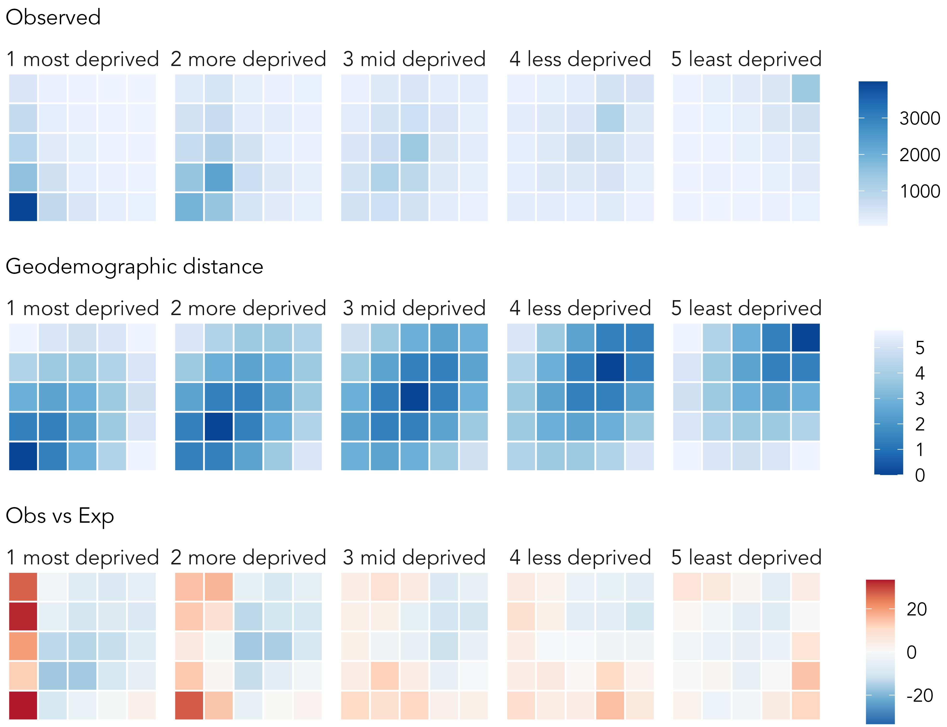
The vertical block of red in the left column of the left-most matrix (crashes occurring in high-deprivation areas) indicates higher than expected crash counts for pedestrians living and being hit in the most deprived quintile, both by drivers living in that high-deprivation quintile and the less-deprived quintiles (especially the lowest quintiles). This pattern is important as it persists even after having modelled for ‘geodemographic distance’. There is much to unpick elsewhere in the graphic. Like many health issues, pedestrian road injuries have a heavy socio-economic element, and our analysis has identified several patterns worthy of further investigation. However, this model-backed exploratory analysis provides direct evidence of the previously suggested “importing effect” of drivers from low-deprivation areas crashing and injuring predestrians in high-deprivation areas.
The modelling is somewhat involved – a more gentle introduction to model-based visual analysis appears in Chapters 6 and 7 – but code for generating the model and graphics in Figure 4.11 is below.
Code
model_data <- ped_veh_complete |>
  mutate(
    # Derive numeric values from IMD classes (ordered factor variable).
    across(
      .cols=c(casualty_quintile, driver_quintile, crash_quintile),
      .fns=list(num=~as.numeric(
        factor(., levels=c("1 most deprived", "2 more deprived",
        "3 mid deprived", "4 less deprived", "5 least deprived"))
        ))
    ),
    # Calculate demog_distance.
    demog_dist=sqrt(
      (casualty_quintile_num-driver_quintile_num)^2 +
      (casualty_quintile_num-crash_quintile_num)^2 +
      (driver_quintile_num-crash_quintile_num)^2
    )
  ) |>
  # Calculate on observed cells: each ped-driver IMD class combination.
  group_by(casualty_quintile, driver_quintile, crash_quintile) |>
  summarise(crash_count=n(), demog_dist=first(demog_dist)) |> ungroup()

# Model crash count against demographic distance allowing the intercept
# to vary on crash quintile, due to large differences in obs frequences.
# between location quintiles.
model <- lme4::glmer(crash_count ~ demog_dist + ( 1 | crash_quintile),
                     data=model_data, family=poisson, nAGQ = 100)

# Extract model residuals.
model_data <- model_data %>%
  mutate(ml_resids=residuals(model, type="pearson"))

# Plot.
model_data |>
  ggplot(aes(x=casualty_quintile, y=driver_quintile)) +
  geom_tile(aes(fill=ml_resids), colour="#707070", size=.2) +
  scale_fill_distiller(palette="RdBu", direction=-1,
  limits=c(
    -max(abs(model_data$ml_resids)),
    max(abs(model_data$ml_resids))
  )) +
  facet_wrap(~crash_quintile, nrow=1) +
  coord_equal()
Task 2: Design challenge
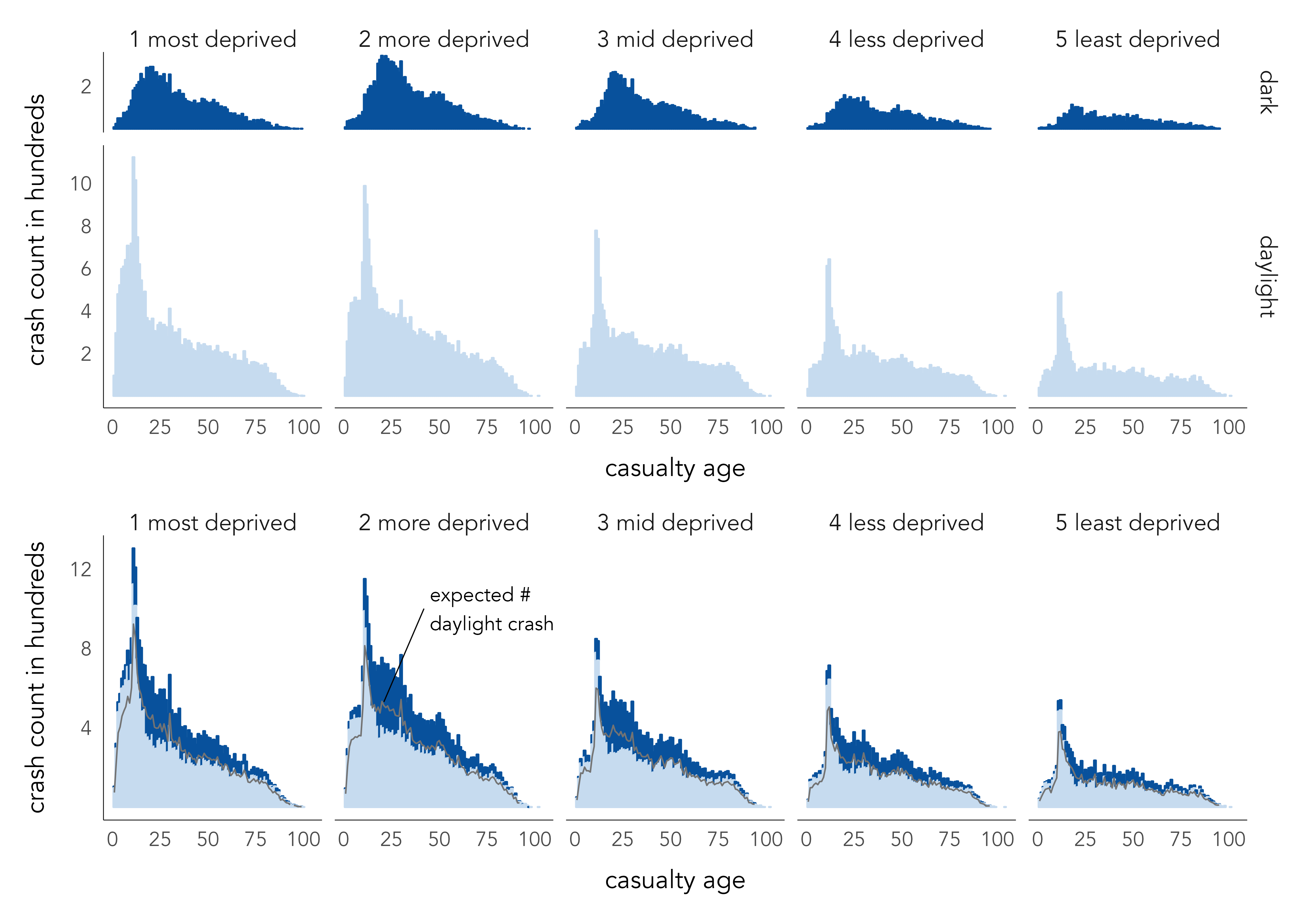
Key to developing data graphics in any exploratory anaysis is proficiency in implementing strategies for comparison (e.g. Table 4.4). Figure 4.12 makes use of juxtaposition (top graphic) and superposition + explicit encoding (bottom graphic) to compare pedestrian casualties taking place in daylight versus darkness and against the age of pedestrians injured and the IMD class of the crash location.
As expected from the analysis at the start of this chapter, there is a peak in younger adults being injured in pedestrian road crashes. For crashes taking place in darkness, this peak is less extreme and shifts to slightly ‘older’ young adult ages.
In total, 71% of recorded pedestrian crashes occur in daylight. The bottom graphic uses this proportion to explicitly encode an expected number of daylight crashes at each age group – e.g. if one were to randomly select an age and deprivation grouping, we would expect 71% of crashes to occur in daylight. This addition helps expose that there are slightly more crashes recorded in darkness for crashes taking place in mid-deprivation locations and involving younger and middle-age pedestrians. A more subtle pattern is of slightly fewer crashes in darkness than expected in older adults.
Try writing some dplyr and ggplot2 code to generate data graphics similar to Figure 4.12, or perhaps using the same layout and plot grammar but conditioning on some other category of interest in the ped_veh dataset. You will want to consider how the variables (age_of_casualty, crash_quintile, light_conditions) are mapped to visual channels via position, colour and spatial region.
4.4 Conclusions
Exploratory data analysis (EDA) is an approach to analysis that aims to amplify knowledge and understanding of a dataset. The idea is to explore structure, and data-driven hypotheses, by quickly generating many often throwaway statistical and graphical summaries. In this chapter we discussed chart types for exposing distributions and relationships in a dataset, depending on data type. We also showed that EDA is not model-free. Data graphics help us to see dominant patterns and from here formulate expectations that are to be modelled. Different from so-called confirmatory data analysis, however, in an EDA the goal of model-building is not to “identify whether the model fits or not […] but rather to understand in what ways the fitted model departs from the data” (Gelman 2004). We covered visualization approaches to supporting comparison between data and expectation using juxtaposition, superimposition and explicit encoding (Gleicher et al. 2011). The chapter did not provide an exhaustive survey of EDA approaches, and certainly not an exhaustive set of chart types and model formulations for exposing distributions and relationships. By linking the chapter closely to the STATS19 dataset, we learnt a workflow for EDA that is common to most effective data analysis and communication activity:
- Expose pattern
- Model an expectation derived from that pattern
- Show deviation from expectation
4.5 Further Reading
For discussion of exploratory analysis and visual methods in modern data analysis:
- Hullman, J. and Gelman, A. 2021. “Designing for Interactive Exploratory Data Analysis Requires Theories of Graphical Inference” Harvard Data Science Review, 3(3). doi: 10.1162/99608f92.3ab8a587.
Further discussion with implemented examples for road safety analysis:
- Beecham, R., and R. Lovelace. 2023. “A Framework for Inserting Visually-Supported Inferences into Geographical Analysis Workflow: Application to Road Safety Research” Geographical Analysis, 55: 344–366. doi: 10.1111/gean.12338.
For an introduction to exploratory data analysis in the tidyverse:
- Wickham, H., Çetinkaya-Rundel, M., Grolemund, G. 2023, “R for Data Science, 2nd Edition”, Sebastopol, CA: O’Reilly.
- Chapter 10.
- Ismay, C. and Kim, A. 2020. “Statistical Inference via Data Science: A ModernDive into R and the Tidyverse”, New York, NY: CRC Press. doi: 10.1201/9780367409913.