6 Models
By the end of this chapter you should gain the following knowledge and practical skills.
Knowledge
Practical skills
6.1 Introduction
So far the analysis presented in this book has been data-driven. Having described data in a consistent way (Chapter 2), visual analysis approaches have been applied, informed by established visualization guidelines. Chapters 4 and 5 involved model building, but these were largely value-free models based on limited prior theory. This chapter is presented as a worked data analysis. We look at a well-known dataset with a more explicit and theoretically-informed motivation.
The chapter explores variation in voting behaviour in the UK’s 2016 referendum on leaving the EU. You might remember that while there was a slight majority for Leave (c. 52%), the vote varied between different parts of the country. There were many explanations offered for why particular places voted the way they did, often related to the demographic composition of those areas. We will explore whether the discussed compositional demographic factors vary systematically with area-level Leave voting. Using regression frameworks, we will model the relative effect of each of these compositional factors in structuring variation in the vote and construct data graphics that allow these models and parameters to be evaluated in detail.
Regression primer
This chapter assumes some basic familiarity with linear regression modelling. For a fuller overview, with excellent and real-world social science examples, you may wish to consult Regression and Other Stories (Gelman, Hill, and Vehtari 2020).
6.2 Concepts
6.2.1 Quantifying and exploring variation
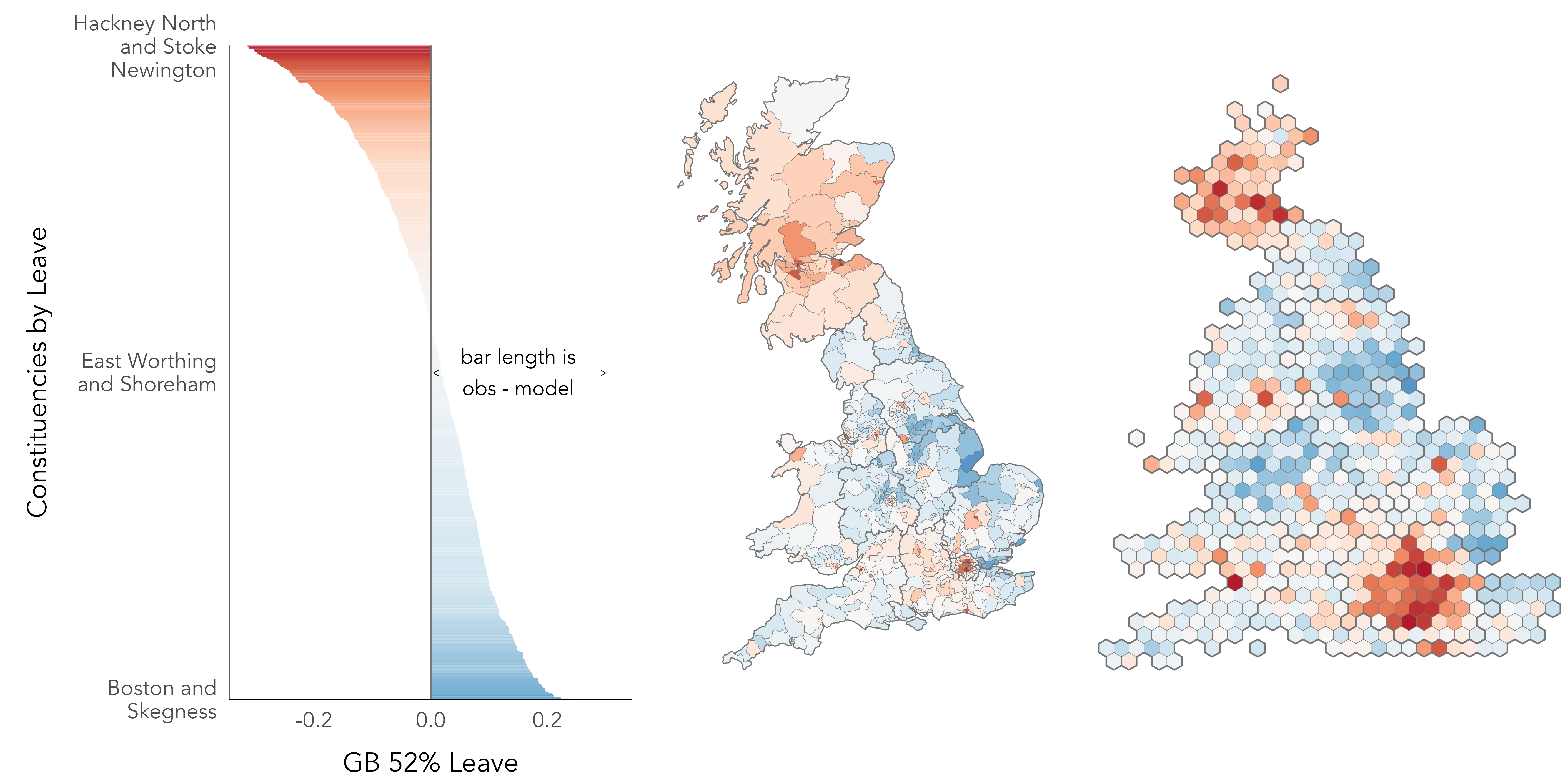
In Figure 6.1 is a map and bar chart of voting in the 2016 EU referendum, estimated at Parliamentary Constituency level (see Hanretty 2017). The values themselves are the difference in estimated vote shares from an expectation that the Leave vote by constituency, y_{i} our outcome of interest, is uniformly distributed across the country and so equivalent to the overall Great Britain (GB) vote share for Leave of c. 52%. Although a slightly contrived formulation, we could express this as an intercept-only linear regression model, where the estimated slope (\beta_{1}) is ‘turned off’ (takes the value 0) and the intercept (\beta_{0}) is the GB average vote share for Leave (\bar{y}):
\begin{align*} y_{i}= \beta_{0} + \beta_{1} + \varepsilon_{i} \end{align*}
So we estimate the Leave vote in each constituency (y_{i}) as a function of:
- \beta_{0}, the intercept, the GB average vote share (\bar{y}) +
- \beta_{1}=0, a negated slope, +
- \varepsilon_{i}, a statistical error term capturing the difference between y_{i}, the observed Leave vote in a constituency, and the unobservable ‘true population’ value of the Leave vote in each constituency
How does this relate to the idea of characterising variation? The length and colour of each bar in Figure 6.1 is scaled according to model residuals: the difference between y_{i}, the observed value, and the expected value of the Leave vote under the uniform model. The sum of these bar lengths is therefore the total variance that we later try to account for by updating our regression model to generate new expected values using information on the demographic composition of constituencies.
Figure 6.1 is similar to the maps that were published widely in press reports in the aftermath of the vote, and demonstrates that there is indeed substantial variation in Leave voting between different parts of the country. The intercept-only model consistently underestimates the vote in Scotland and most of London. Outside of this, constituencies voting in smaller proportions than would be expected for Leave are distributed more sparsely in the country: the dark red dot with surrounding red area in the east of England is Cambridge and Cambridgeshire, constituencies in Bristol (south west), Manchester and Liverpool (north west) and Brighton (south) are also reasonably strong red.
When evaluating the effectiveness of modelled values, there are various checks that can be performed. A relevant check here is whether there is bias in the residuals – whether residuals have structure that suggests they are grouped in a way not captured by the model. Given the motivation behind our analysis, it is no surprise that there is a geographic pattern to the residuals in Figure 6.1, but also the non-symmetrical shape of the ‘signed’ bars in the left of the graphic. There are more constituencies with positive values than negative; the Leave vote is underestimated by the uniform model for 57% of constituencies, and some constituencies have quite large negative values. The strongest vote for Leave was Boston and Skegness with 76% for Leave, but the strongest for Remain was Hackney North and Stoke Newington with 80% for Remain.
6.2.2 Quantifying and exploring co-variation
More interesting still is whether the pattern of variation in Figure 6.1 is correlated with compositional factors that we think explain this variation; and whether bias or structure in residuals exists even after accounting for these compositional factors.
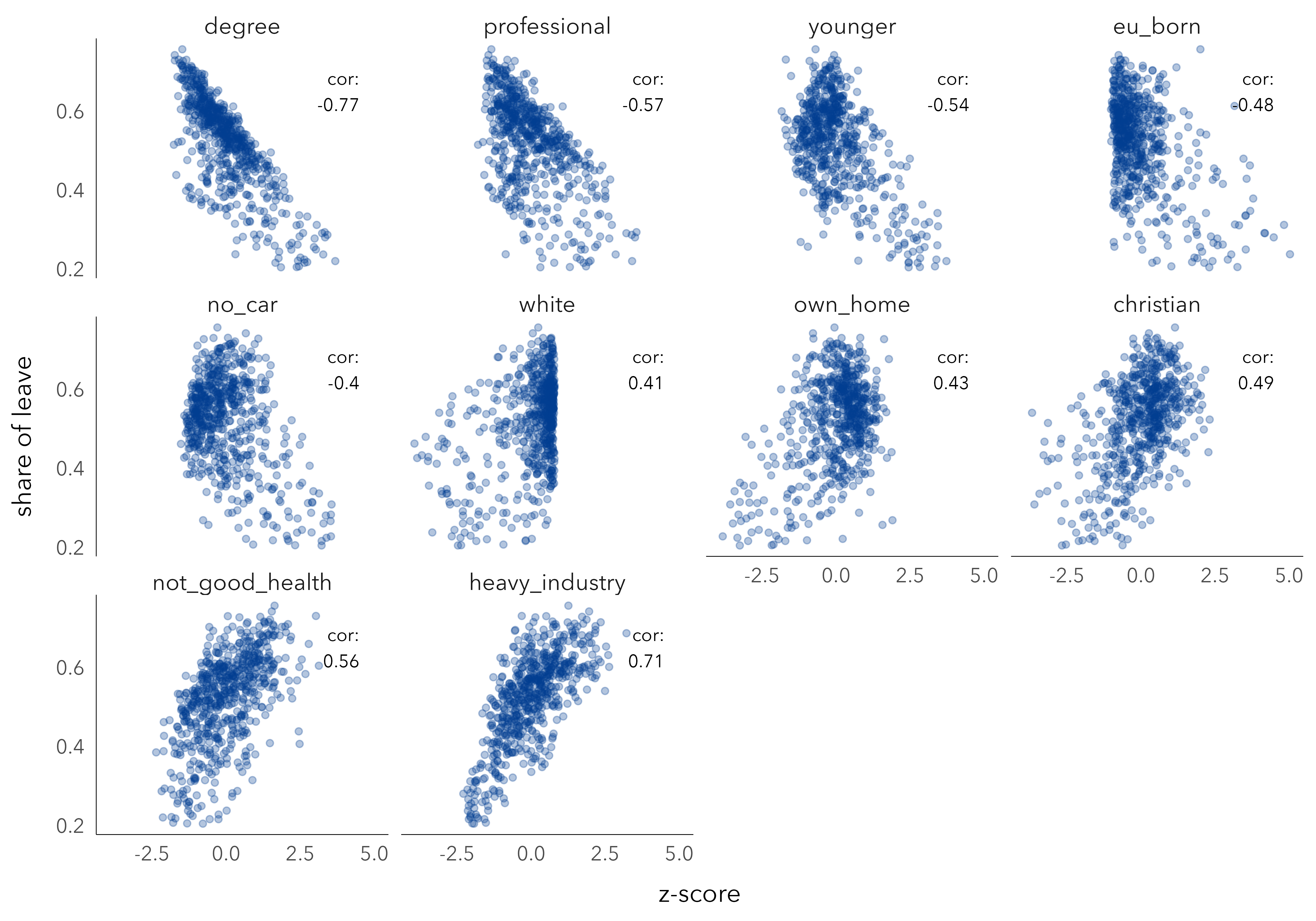
In Table 6.1 is a list of possible explanatory variables describing the demographic composition of constituencies. Each variable is expressed as a proportion of the constituency’s population. So the degree-educated variable describes the proportion of residents in the constituency educated at least to degree-level. Comparison across these variables is challenging due to the fact that their ranges differ: the EU-born variable ranges from 0.6% to 17%; the white variable from 14% to 98%. Common practice for addressing these sorts of range problem is to z-score transform the variables so that each is expressed in standard deviation units from its mean.
| Census variable | Constituency % |
|---|---|
| post-industrial / knowledge economy | |
| degree-educated | with degrees + |
| professional occupations | ns-sec manager/professional |
| younger adults | adults aged <44 |
| heavy industry | manufacturing and transport |
| diversity/values/outcomes | |
| not good health | reported fair, bad, very bad |
| white | ethnicity white British/Irish |
| Christian | Christian |
| EU-born | EU-born (not UK) |
| metropolitan / 'big city' | |
| own home | own home |
| no car | don't own a car |
Figure 6.2 presents scatterplots from which the extent of linear association between these demographics and Leave voting in each constituency can be inferred. Each dot is a constituency, arranged on the x-axis according to the value of the explanatory variable and the y-axis according to the share of Leave vote. The scatterplots are faceted by explanatory variable and ordered left-to-right and top-to-bottom according to correlation coefficient. The variable most heavily correlated with Leave voting is degree-education: as the share of a constituency’s population educated at least to degree-level increases, the share of Leave vote in that constituency decreases. An association in the same direction, but to a lesser extent, is observed for variables representing similar concepts: professional occupations, younger adults, EU-born, no-car and the reverse for Christian, not-good health and heavy industry.
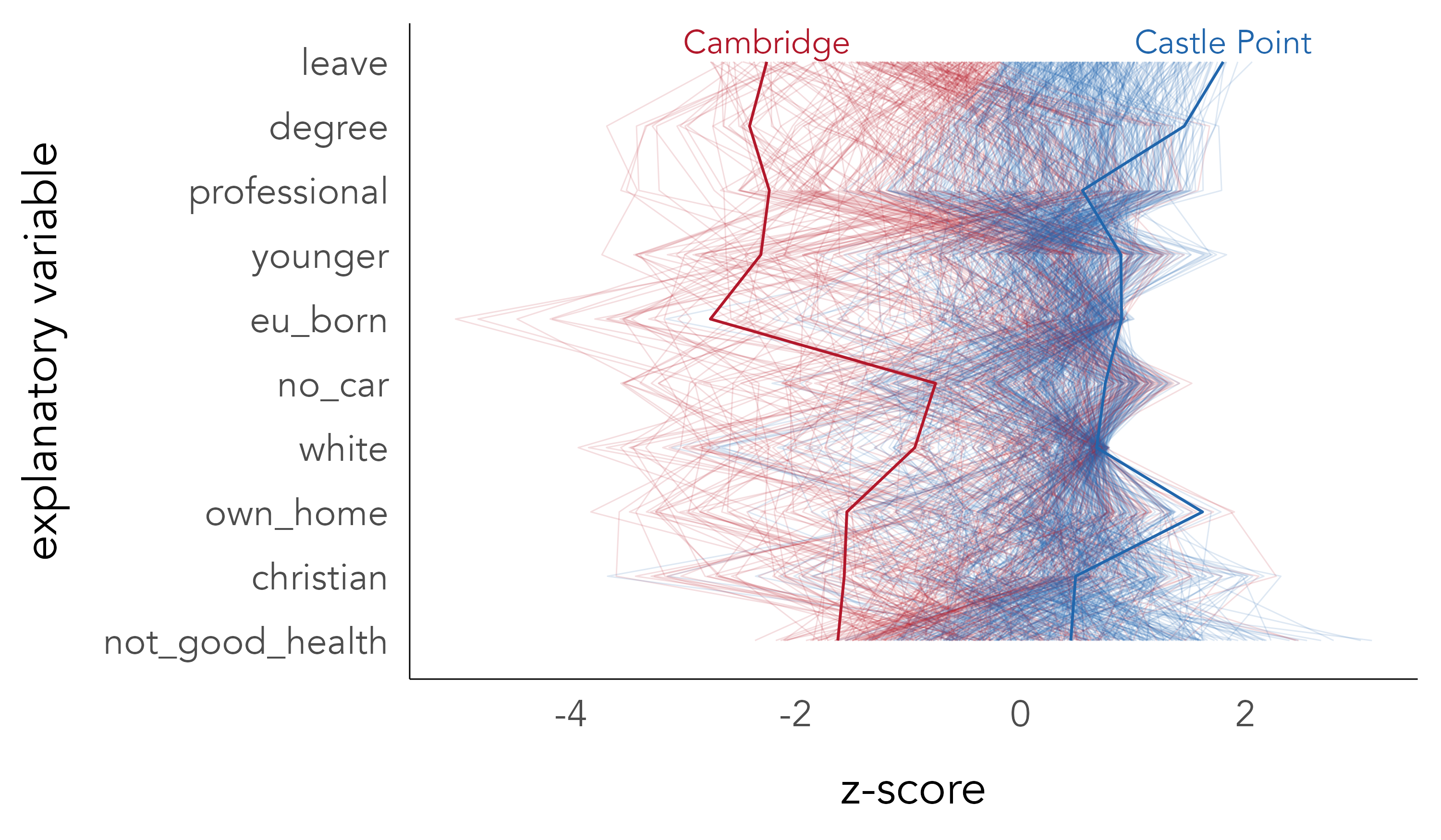
It is of course likely that many of the compositional characteristics of constituencies vary with Leave voting in consistent ways. Parallel coordinate plots may help visually explore this multivariate space. Whereas in scatterplots observations are represented as points located in x- and y- axes that are orthogonal, in a parallel coordinate plot observations are laid out across many parallel axes and the values of each observation encoded via a line connecting the multiple parallel axes. In Figure 6.3 each of the thin lines is a constituency coloured according to the recorded voting outcome – either majority Remain (red) or Leave (blue). The first variable encoded is the size of the Leave vote, and variables are then ordered on their linear association with Leave. Note that we have reversed the polarity of variables such as degree-educated and professional so that we expect more Leave (blue lines) towards the right locations of the parallel axes. That the blue and red lines are reasonably separated suggests that there is a consistent pattern of association across many of the demographics characteristics in constituencies voting differently on Leave and Remain.
On parallel coordinate plots
Although parallel coordinate plots enable some aspects of association between multiple variables to be inferred, they have several deficiencies. Association can only be directly inferred by comparing variables that are immediately adjacent. The order of parallel variables can greatly affect their visual appearance. And the corollary is that visual patterns of the plot that are salient may be incidental to the statistical features being inferred.
6.2.3 Modelling for co-variation
Linear regression provides a framework for systematically describing the associations implied by the scatterplots and parallel coordinate plot, and with respect to the constituency-level variation identified in Figure 6.1. Having seen these data, the demographic variables in Figure 6.2, we can derive new expected values of constituency-level Leave voting.
To express this in equation form, we update the uniform model such that Leave vote is a function of the selected explanatory variables. For single-variable linear regression, we might select the proportion of residents educated at least to degree-level ({d_{i1}}):
\begin{align*} y_{i}&= \beta_{0} + \beta_{1}{d_{i1}} + \varepsilon_{i} \\ \end{align*}
So we now estimate the Leave vote in each constituency (y_{i}) as a function of:
- \beta_{0}, the intercept, the GB average vote share (\bar{y}) +
- \beta_{1}=\beta_{1}{d_{i1}}, the slope, indicating in which direction and to what extent degree-educated is associated with Leave, +
- \varepsilon_{i}, the difference between y_{i} (the observed value) and the unobservable ‘true population’ value of the Leave vote in that constituency (statistical error)
It is of course likely that some demographic variables account for different elements of variation in the Leave vote than others. You will be aware that the linear regression model can be extended to include many explanatory variables:
\begin{align*} y_{i}&= \beta_{0} +\beta_{1}x_{i1} + ... + \beta_{k}x_{ik} + \varepsilon_{i} \\ \end{align*}
So this results in separate \beta_{k} coefficients for separate explanatory variables. These coefficients can be interpreted as the degree of association between the explanatory variable k and the outcome variable, keeping all the other explanatory variables constant – or the distinct correlation between an explanatory variable k and the outcome variable, net of the other variables included in the model.
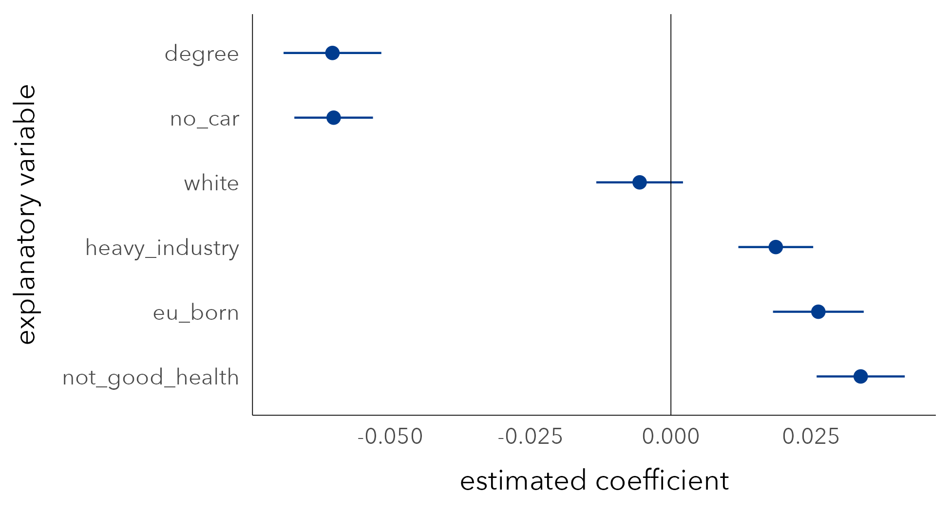
In Figure 6.4 are regression coefficients (\beta_{k}) from a multiple regression model with degree-educated, no car, white, heavy industry, EU-born and not good health selected as explanatory variables. Coefficients are reported as dots with estimates of uncertainty represented as lines encoding 95% confidence intervals. Most variables’ coefficients are in the direction that would be expected given the associations in Figure 6.2. Net of variation in the other compositional factors, increased levels of degree-education in a constituency has the effect of reducing the Leave vote. The two exceptions are EU-born and white: after controlling for variation in the other demographic variables, increased proportions of white residents reduces the Leave vote, and increased proportions of residents that are EU-born increases the Leave vote. Since the confidence interval for white crosses zero, this coefficient is subject to much uncertainty. Further exploration may allow us to identify whether these counter-intuitive effects are genuine or the result of a poorly-specified model.
6.2.4 Evaluating model bias
Our analysis becomes more interesting when we start to explore and characterise model bias: any underlying structure to the observations that is less well accounted for by the model.
For area-level regression models such as ours, it is usual for residuals to exhibit some spatial autocorrelation structure. For certain parts of a country a model will overestimate an outcome given the relationship implied between explanatory and outcome variables; for other parts the outcome will be underestimated. This might occur due to:
- Spatial dependence in variable values over space. We know that the geography of GB is quite socially distinctive, so it is reasonable to expect, for example, the range in variables like heavy industry and white to be bounded to economic regions and metropolitan-versus-peripheral regional contexts.
- Spatial nonstationarity in processes over space. It is possible that associations between variables might be grouped over space – that the associations vary for different parts of the country. For example, high levels of EU-born migration might affect political attitudes, and thus area-level voting, differently in different parts of the country.
We can test for and characterise spatial autocorrelation in residuals by performing a graphical inference test, a map line-up (Beecham et al. 2017; Wickham et al. 2010) against a null hypothesis of complete spatial randomness (CSR). A plot of real data, the true map of residuals, is hidden amongst a set of decoys; in this case maps with the residual values randomly permuted around constituencies. If the real map can be correctly identified from the decoys, then this lends statistical credibility to the claim that the observed data are not consistent with the null of CSR. Graphical line-up tests have been used in various domains, also to test regression assumptions (Loy, Hofmann, and Cook 2017). The map line-up in Figure 6.5 demonstrates that there is very obviously spatial and regional autocorrelation in residuals, and therefore structure that our regression model misses.
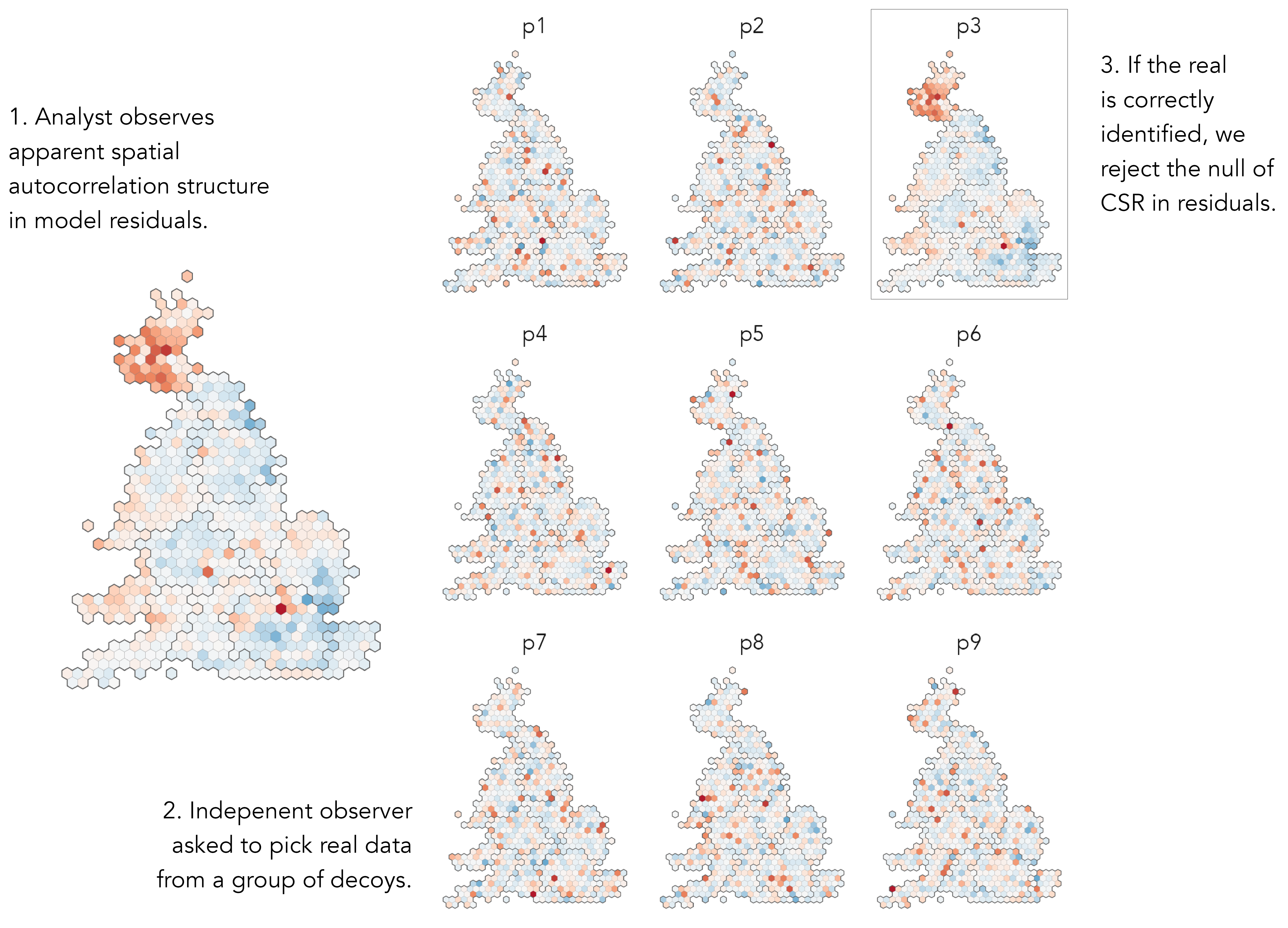
There are different ways of updating our model according to this geographic context. We have talked about patterning in residuals as being spatial, with values varying smoothly and continuously depending on location. This might be the case, but given the phenomena we are studying, it also plausible that distinct contexts are linked to regions. The residuals in Figure 6.5 – the real being plot 3 – do seem to be grouped by regional boundaries, particularly Scotland looks categorically different. This suggests that geographic context might be usefully represented as a category rather than a continuous variable (location in x,y). We will therefore update our model representing geographic context as a regional grouping and cover approaches both to modelling spatial dependence in values and spatial nonstationarity in processes.
6.2.5 Geographic context as grouped nuisance term
A common approach to treating geographic dependence in the values of variables is to model geographic context as a Fixed Effect (FE). A dummy variable is created for each group (region in our case), and every region receives a constant. Any group-level sources of variation in the outcome are collapsed into the FE variable, which means that regression coefficients are not complicated by this more messy variation – they now capture the association between demographics and Leave after adjusting for systematic differences in the Leave vote due to region. So, for example, we know that Scotland is politically different from the rest of GB and that this appears to drag down the observed Leave vote for its constituencies. The constant term on region adjusts for this and prevents the estimated regression coefficients (inferred associations between variables) from being affected. Also estimated via the constant is the ‘base level’ in the outcome for each element of the group – net of demographic composition, the expected Leave vote in each region.
The linear regression model, extended with the FE term ({\gamma_{j}}), for a single variable model:
\begin{align*} y_{i}&= {\gamma_{j}} + \beta_{1}x_{i1} + \varepsilon_{i} \\ \end{align*}
So we now estimate the Leave vote in each constituency (y_{i}) as a function of:
- {\gamma_{j}}, a constant term similar to an intercept for region j, +
- \beta_{1}=\beta_{1}x_{i1}, the slope, indicating in which direction and to what extent some explanatory variable measured at constituency i is associated with Leave, +
- \varepsilon_{i}, the difference between y_{i} (the observed value) at constituency i and the unobservable true population value of the Leave vote in that constituency (statistical error)
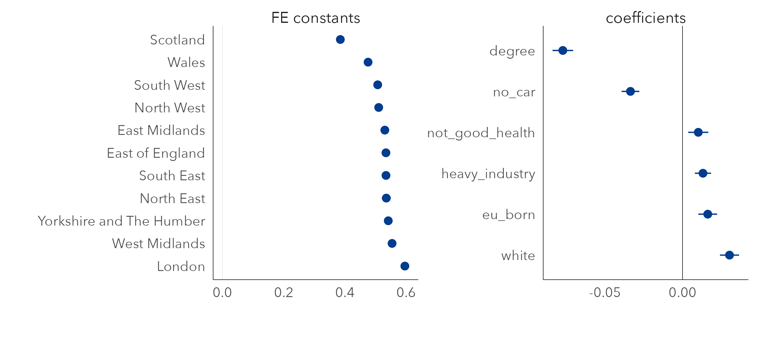
Presented in Figure 6.6 are updated regression coefficients for a multivariate model fit with a FE on region. In the left panel are the FE constants. Together these capture the variance in Leave vote between regions after accounting for demographic composition. London is of particular interest. When initially analysing variation in the vote, constituencies in Scotland and London were distinctive in voting in much smaller proportions than the rest of the country for Leave. Given the associations we observe with Leave voting and demographic composition, however, if we were to randomly sample two constituencies that contain the same demographic characteristics, one in London and one in another region (say North West), on average we would expect the Leave vote for the London constituency to be higher (~60%) than that sampled from North West (~51%). A separate and more anticipated pattern is that Scotland would have a lower Leave vote (~38%) – that is, net of demographics there is some additional context in Scotland that means Leave is lower than in other regions.
In the right panel are the regression coefficients net of this between-region variation. Previously the white variable had a slight negative association with Leave, counterintuitively. Now the white variable has a direction of effect that conforms to expectation – net of variation in other demographics, increased proportions of white residents is associated with increased Leave voting. For another variable, EU born, the coefficient still unexpectedly suggests a positive association with Leave.
6.2.6 Geographic context as grouped effects
Rather than simply allowing a constant term to vary, we can update the linear regression model with an interaction term ({\beta_{1j}}{x_{i1}}) that permits the coefficient estimates to vary depending on region. This means we get a separate constant term and coefficient estimate of the effect of each variable on Leave for every region.
\begin{align*} y_{i}&= {\gamma_{j}} + {\beta_{1j}}x_{i1} + \varepsilon_{i} \\ \end{align*}
- {\gamma_{j}}, a constant term similar to an intercept for region j, +
- {\beta_{1j}}x_{i1}, the region-specific slope, indicating in which direction and to what extent some demographic variable at constituency i and in region j is associated with Leave, +
- \varepsilon_{i}, the difference between y_{i} (the observed value) at constituency i and the unobservable true ‘population’ value of the Leave vote in that constituency (statistical error)
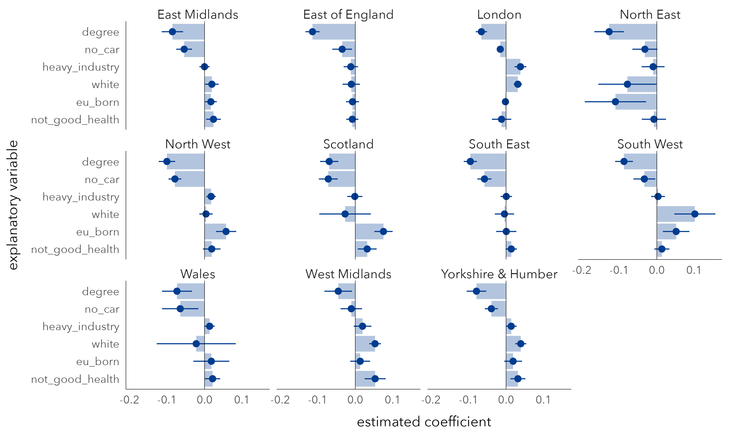
In Figure 6.7 are region-specific coefficients derived from a multivariate model fit with this interaction term. In each region, degree-educated has a negative coefficient and with reasonably tight uncertainty estimates, or at least CIs that do not cross 0. The other variables are subject to more uncertainty. The no-car variable is also negatively associated with Leave, a variable we thought may separate metropolitan versus peripheral contexts, but the strength of negative association, after controlling for variation in other demographic factors, does vary by region. The heavy industry variable, previously identified as being strongly associated with Leave, has a clear positive association only for London and to a much lesser extent for North West and Wales (small coefficients). The EU-born variable is again the least consistent as it flips between positive and negative association when analysed at the regional-level: after controlling for variation in other demographic characteristics, it is positively associated with Leave for North West, Scotland, South West, but negatively associated with Leave for the North East, though with coefficients that are subject to much variation.
6.2.7 Estimate volatility and alternative modelling approaches
Our treatment of regression frameworks has in this chapter been reasonably breezy; there are problems that we have not discussed. Introducing FE and interaction terms without adding data reduces statistical power as data are heavily partitioned. Given the fact that our data are hierarchically structured (constituencies sit within regions), hierarchical or multi-level modelling may be more appropriate to this sort of regional grouping. Multi-level modelling uses partial pooling, borrowing data to make estimated coefficients more conservative, less locally biased, where there are comparatively few observations in particular groupings (see Gelman and Hill 2006). There are also many ways in which associations between values can be modelled continuously over space. For the case of geographically weighted regression (GWR) (Brunsdon, Fortheringham, and Charlton 2002), local regression coefficients for each spatial unit. Geographically Weighted-statistics enable spatial non-stationarity in process to be flexibly explored and characterised – in this case study, interesting and explainable directions of effect between Leave voting and EU-born (see Beecham, Slingsby, and Brunsdon 2018). Since GWR involves generating many hundreds of parameter estimates, visual approaches are as ever primarily used in their interpretation and analysis (see Dykes and Brunsdon 2007).
6.3 Techniques
The technical element to this chapter demonstrates how linear regression models can be specified in R, including approaches to extract model summaries and diagnostics, and of course how to represent and evaluate them using data graphics. Data recording estimated vote shares for Leave by Parliamentary Constituency, as well as constituency-level Census demographics, were originally collected from the parlitools package.
6.3.1 Import, transform, explore
- Download the
06-template.qmd1 file for this chapter, and save it to yourvis4sdsproject. - Open your
vis4sdsproject in RStudio, and load the template file by clickingFile>Open File ...>06-template.qmd.
The template file lists the required packages: tidyverse, sf and tidymodels for extracting model outputs. The processed data with selected 2011 Census demographics can be loaded from the book’s accompanying data repository. In this folder is also a .geojson file containing a hexagon cartogram of UK parliamentary constituencies, derived from Open-Innovations’ HexJSON format.
Explanatory variables describing the demographic composition of constituencies are recorded as proportions. In order to support comparison in the multivariate models, they must be z-score transformed. The distance between observed values for each 2011 Census variable is expressed in standard deviation units from the mean across constituencies for that variable. Our approach is to perform this transformation on each explanatory variable before piping into the model specification. This is achieved with across(). The first argument is the set of columns to which you would like the same function to be applied, and the second is the function you would like to apply. Remembering that mutate() works over columns of a data frame, and that a single column of a data frame is a vector of values, the notation .x is used to access each element of the columns being worked across.
# z-score transform explanatory variables before model
# specification.
cons_data |>
  mutate(
    across(
      .cols=c(younger:heavy_industry),
      .fns=~(.x-mean(.x))/sd(.x)
      )
  )
  <some-model-specification-code>
In Figure 6.2 and Figure 6.3 associations between candidate explanatory variables and Leave are explored using scatterplots and parallel coordinate plots respectively. To avoid cluttering this section, documented code for reproducing these plots is in the 06-template.qmd file for this chapter and inserted below, but without detailed explanation.
Expose code for parallel coordinate plots
# Data staging and ggplot2 code for PCPs --------------------------

# Pull out and order variable names on their correlation with Leave.
order_vars <- cons_data |>
  mutate(across(c(younger:heavy_industry), ~(.x-mean(.x))/sd(.x))) |>
  pivot_longer(
    cols=younger:heavy_industry, names_to="expl_var", values_to="prop"
    ) |>
  group_by(expl_var) |>
  summarise(cor=cor(leave,prop)) |> ungroup() |> arrange(cor) |>
  pull(expl_var)
# Create staged dataset for plotting.
plot_data <- cons_data |>
  mutate(
    majority=if_else(leave>.5, "Leave", "Remain"),
    across(c(leave, younger:heavy_industry), ~(.x-mean(.x))/sd(.x)),
    decile=ntile(leave, 10),
    is_extreme = decile > 9 | decile < 2
  )  |>
  # Select out variables needed for plot.
  select(
    majority, is_extreme, constituency_name, leave,
    degree, professional, younger, eu_born, no_car, white, own_home,
    christian, not_good_health, heavy_industry
    ) |>
  # Change polarity in selected variables.
  mutate(
    degree=-degree, professional=-professional, younger=-younger,
    eu_born=-eu_born, no_car=-no_car
  ) |>
  # Gather explanatory variables for along rows.
  pivot_longer(
    cols= c(leave:not_good_health), names_to="var", values_to="z_score"
    ) |>
  # Recode new explanatory variable as factor ordered according to
  # known assocs. Reverse order here as coord_flip() used in plot.
  mutate(
    var=factor(var, levels=c("leave", order_vars)),
    var=fct_rev(var)
  )
# Plot PCP.
plot_data |>
  ggplot(
    aes(x=var, y=z_score, group=c(constituency_name),
    colour=majority)) +
  geom_path( alpha=0.15, linewidth=.2) +
  scale_colour_manual(values=c("#2166ac", "#b2182b")) +
coord_flip()6.3.2 Model tidily
The most straightforward way of specifying a linear regression model is with the lm() function and summary() to extract regression coefficients.
model <- cons_data |>
  mutate(
    across(
      .cols=c(younger:heavy_industry),
      .fns=~(.x-mean(.x))/sd(.x)
      )
  ) %>%
  lm(leave ~ degree, data=.)

summary(model)
# Call:
# lm(formula = leave ~ degree, data = .)
#
# Residuals:
#      Min       1Q   Median       3Q      Max
# -0.25521 -0.02548  0.01957  0.05143  0.11237
#
# Coefficients:
#             Estimate Std. Error t value Pr(>|t|)
# (Intercept)  0.520583   0.002896  179.78   <2e-16 ***
# degree      -0.088276   0.002898  -30.46   <2e-16 ***
# ---
# Signif. codes:  0 ‘***’ 0.001 ‘**’ 0.01 ‘*’ 0.05 ‘.’ 0.1 ‘ ’ 1
#
# Residual standard error: 0.07279 on 630 degrees of freedom
# Multiple R-squared:  0.5956,  Adjusted R-squared:  0.595
# F-statistic: 927.9 on 1 and 630 DF,  p-value: < 2.2e-16
With tidymodels, specifically the broom package, we can extract model outputs in a format that adheres to tidy data (Wickham 2014).
-
tidy()returns estimated coefficients as a data frame.
tidy(model)
# # A tibble: 2 × 5
# term        estimate std.error statistic   p.value
# <chr>          <dbl>     <dbl>     <dbl>     <dbl>
# 1 (Intercept)   0.521    0.00290     180.  0
# 2 degree -0.0883 0.00290 -30.5 5.67e-126-
glance()returns a single row containing summaries of model fit.
glance(model)
# # A tibble: 1 × 12
# r.sq adj.r.sq  sigma   stat p.value     df logLik   AIC   BIC
# <dbl>   <dbl>  <dbl>  <dbl>  <dbl>   <dbl>  <dbl> <dbl>  <dbl>
#  1    0.596  0.595 0.0728   928.5.67e-126   1   760 -1514. -1501.
# # ℹ 3 more variables: deviance <dbl>, df.residual <int>, nobs <int>-
augment()returns a data frame of residuals and predictions (fitted values) for the model realisation.
augment(model)
# # A tibble: 632 × 8
# leave  degree .fitted   .resid    .hat .sigma   .cooksd .std.resid
# <dbl>   <dbl>   <dbl>    <dbl>   <dbl>  <dbl>     <dbl>      <dbl>
# 1 0.579 -0.211    0.539  0.0398  0.00165 0.0728 0.000247     0.547
# 2 0.678 -0.748    0.587  0.0914  0.00247 0.0728 0.00195      1.26
# 3 0.386  1.63     0.376  0.00957 0.00582 0.0729 0.0000509    0.132
# 4 0.653 -0.964    0.606  0.0473  0.00306 0.0728 0.000648     0.650
# ...
The advantage of generating model diagnostics and outputs that are tidy is that it eases the process of working with many model realisations. This is a common requirement for modern data analysis, where statistical inferences are made empirically from resampling. For example, we may wish to generate single-variable linear regression models separately for each selected explanatory variable. We could use these outputs to annotate the scatterplots in Figure 6.2 by their regression line and colour observations according to their residual values, distance from the regression line. These models can be generated with reasonably little code by making use of the package broom and a style of functional programming in R, which is supported by the purrr package.
Example code:
single_model_fits <- cons_data |>
  mutate(across(c(younger:heavy_industry), ~(.x-mean(.x))/sd(.x))) |>
  pivot_longer(
    cols=younger:heavy_industry,
    names_to="expl_var", values_to="z_score"
    ) |>
  # Nest to generate list-column by expl_var.
  nest(data=-expl_var) |>
  mutate(
    # Use map() to iterate over the list of datasets.
    model = map(data, ~lm(leave ~ z_score, data = .x)),
    # glance() for each model fit.
    fits = map(model, glance),
    # tidy() for coefficients.
    coefs = map(model, tidy),
    # augment() for predictions/residuals.
    values=map(model, augment),
  )

single_model_fits |>
  # Unnest output from glance.
  unnest(cols = fits) |>
  # Remove other list-columns.
  select(-c(data, model))

# # A tibble: 10 × 15
# expl_var  r.squared adj.r.sq  sigma  stat   p.value  df logLik   AIC
# <chr>         <dbl>    <dbl>  <dbl> <dbl>     <dbl> <dbl> <dbl> <dbl>
# 1 younger    0.289     0.288 0.0965  257. 1.05e- 48   1   582. -1158.
# 2 own_home   0.185     0.184 0.103   143. 7.42e- 30   1   539. -1071.
# 3 no_car     0.157     0.155 0.105   117. 3.81e- 25   1   528. -1050.
# 4 white      0.169     0.168 0.104   128. 3.79e- 27   1   532. -1059.
# 5 eu_born    0.233     0.232 0.100   191. 3.42e- 38   1   558. -1110.
# 6 christian  0.238     0.236 0.100   196. 4.95e- 39   1   560. -1114.
# 7 professi…  0.320     0.319 0.0944  296. 1.08e- 54   1   596. -1186.
# 8 degree     0.596     0.595 0.0728  928. 5.67e-126   1   760. -1514.
# 9 not_good…  0.316     0.315 0.0947  291. 5.93e- 54   1   594. -1182.
# 10 heavy_in… 0.504     0.503 0.0806  640. 5.43e- 98   1   696. -1385.
# # ℹ 6 more variables: BIC <dbl>, deviance <dbl>, df.residual <int>,
# #    nobs <int>, coefs <list>, values <list>
Code description:
-
Setup: In order to generate separate models for separate explanatory variables, we need to generate nested data frames. These are data frames stored in a special type of column (a
list-column) in which the values of the column is a list of data frames – one for each explanatory variable over which we would like to compute a model. You can think of parameterisingnest()in a similar way togroup_by(). We firstpivot_longer()to generate a data frame where each observation contains the recorded Leave vote for a constituency and its correspondingz_scorevalue for each explanatory variable. There are 10 explanatory variables and sonest()returns a data frame with the dimensions10x2– a variable identifying the explanatory variable on which the model is to be built (expl_var) and alist-column, each element containing a data frame with the dimensions632x13. -
Build model: In
mutate(),purrr’smap()function is used to iterate over the list of datasets and fit a model to each nested dataset. The new columnmodelis alist-columnthis time containing a list of model objects. -
Generate outputs: Next, the different cuts of model outputs can be made using
glance(), tidy(), augment(), withmap()to iterate over the list of model objects. The new columns are nowlist-columnsof data frames containing model outputs. -
Extract outputs: Finally we want to extract the values from these nested data. This can be achieved using
unnest()and supplying to thecolsargument the names of thelist-columnsfrom which we want to extract values.
6.3.3 Plot models tidily
In Figure 6.4 estimated regression coefficients are plotted from a multivariate model, annotated with 95% Confidence Intervals. The ggplot2 specification is reasonably straightforward.
The code for Figure 6.4:
model <- cons_data |>
  mutate(across(c(younger:heavy_industry), ~(.x-mean(.x))/sd(.x))) %>%
  lm(leave ~ degree + eu_born + white  + no_car + not_good_health +
    heavy_industry, data=.)

tidy(model) |>
  filter(term != "(Intercept)") |>
  ggplot(
    aes(x=reorder(term, -estimate),
        y=estimate, ymin=estimate-1.96*std.error,
        ymax=estimate+1.96*std.error)
        ) +
  geom_pointrange() +
  coord_flip()
The plot specification:
-
Data: A data frame of model coefficients extracted from the multivariate model object (
model) usingtidy(). -
Encoding: y-position varies according to the size of the coefficient
estimateand the 95% confidence intervals, derived fromstd.errorand encoded usingyminandymaxparameters. -
Marks:
geom_pointrange(), which understandsyminandymax, for the dots with confidence intervals. -
Setting:
coord_flip()to make variable names easier to read.
6.3.4 Extend model terms
To include a Fixed Effect (FE) term on region, the region variable is simply added as a variable to lm(). However, we must convert it to a factor variable; this has the effect of creating dummies on each value of region. Default behaviour within lm() is to hold back a reference value of region with FE regression coefficients describing the effect on the outcome of a constituency located in a given region relative to that reference region. So the reference region (intercept) in the model below is East Midlands – the first in the factor to appear alphabetically. The signed coefficient estimates for regions identifies whether, after controlling for variation in demographics, the Leave vote for a particular region is expected to be higher or lower than this.
cons_data |>
  mutate(
    across(c(younger:heavy_industry), ~(.x-mean(.x))/sd(.x)),
    region=factor(region)) %>%
  lm(leave ~ region + degree + eu_born + white  + no_car +
    not_good_health + heavy_industry, data=.) |>
  tidy()

# # A tibble: 17 × 5
# term                      estimate std.error statistic  p.value
# <chr>                        <dbl>     <dbl>     <dbl>    <dbl>
#   1 (Intercept)                0.530     0.00581    91.3   0
# 2 regionEast of England      0.00363   0.00787     0.462 6.45e- 1
# 3 regionLondon               0.0654    0.00948     6.90  1.30e-11
# 4 regionNorth East           0.00482   0.00945     0.510 6.10e- 1
# 5 regionNorth West          -0.0200    0.00728    -2.75  6.12e- 3
# 6 regionScotland            -0.145     0.00843   -17.2   1.28e-54
# 7 regionSouth East           0.00377   0.00752     0.502 6.16e- 1
# 8 regionSouth West          -0.0233    0.00789    -2.95  3.26e- 3
# 9 regionWales               -0.0547    0.00860    -6.36  3.87e-10
# 10 regionWest Midlands       0.0236    0.00745     3.17  1.59e- 3
# 11 regionYorkshire           0.0112    0.00762     1.47  1.41e- 1
# 12 degree                   -0.0772    0.00339   -22.8   1.30e-83
# 13 eu_born                   0.0163    0.00308     5.29  1.72e- 7
# 14 white                     0.0303    0.00314     9.66  1.18e-20
# 15 no_car                   -0.0336    0.00292   -11.5   6.50e-28
# 16 not_good_health           0.0102    0.00331     3.07  2.24e- 3
# 17 heavy_industry            0.0132    0.00266     4.96  9.23e- 7
We want our model to represent a dummy for every region, and so we add -1 to the specification. Doing this removes the intercept or reference region, making R^2 no longer meaningful.
cons_data |>
  mutate(
    across(c(younger:heavy_industry), ~(.x-mean(.x))/sd(.x)),
    region=factor(region)) %>%
  lm(leave ~ region + degree + eu_born + white  + no_car +
    not_good_health + heavy_industry -1, data=.) |>
 glance()

# # A tibble: 1 × 12
# r.squared adj.r.squared sigma statistic p.value df logLik AIC
# <dbl>  <dbl>  <dbl>  <dbl> <dbl> <dbl> <dbl>  <dbl> <dbl>
#   1    0.995  0.995 0.0371  7625.   0     17  1193. -2351.
# # ℹ 3 more variables: deviance <dbl>, df.residual <int>, nobs <int>
To include an Interaction on region, we need to set a variable that will be used to represent these regional constants (cons), and the Interaction is added with the notation :.
The model updated with the regional Interaction term results in many more coefficients that are, as discussed, somewhat unstable. To plot them, as in Figure 6.7, we minimally update the code used to generate the previous model outputs.
tidy(model) |>
  separate(term, into= c("term", "region"), sep=":") |>
  mutate(region=str_remove(region,"region")) |>
  filter(term!="cons") |>
  ggplot() +
  geom_col(aes(x=reorder(term, -estimate), y=estimate), alpha=.3)+
  geom_pointrange(aes(
    x=reorder(term, -estimate),y=estimate,
    ymin=estimate-1.96*std.error, ymax=estimate+1.96*std.error
  )) +
  geom_hline(yintercept = 0, size=.2)+
  facet_wrap(~region) +
  coord_flip()
The plot specification:
-
Data: A data frame of model coefficients extracted from the multivariate model object using
tidy(). To make clean plot labels we need to remove unnecessary text in thetermvariable (e.g. “cons:regionEast Midlands”).separate()allows us to split this column on:and thenstr_remove()is quite obvious. We do not wish to plot the FE constants and sofilter()them out. - Encoding: y-position varies according to the size of the coefficient estimate and the 95% confidence intervals, in exactly the same way as for Figure 6.4.
-
Marks:
geom_pointrange(), encoded as in Figure 6.4. The only addition is light bars in the background (geom_col()). This seems to aid interpretation of the direction and size of the coefficients. -
Facets:
facet_wrap()onregionin order to display coefficients estimated separately for each region.
6.3.5 Evaluate models with lineups
In Figure 6.8 is a map line-up of the residuals from FE-updated model – our expectation is that these residuals should no longer be spatially autocorrelated, since we collapse regional varation into our FE term.
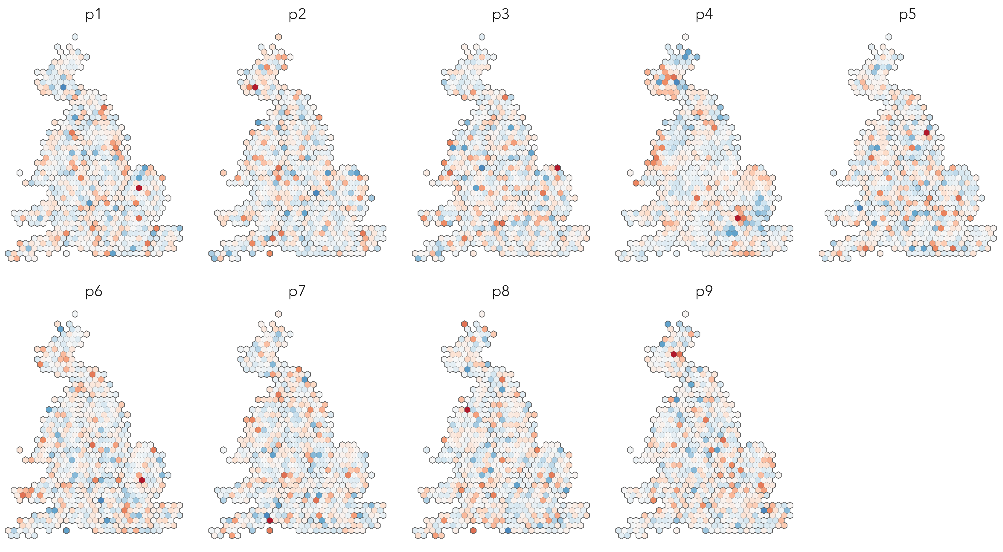
Using functional-style programming, and index{packages!} tidymodels, plot lineups can be generated with surprisingly paired-back code. First generate a model object and extract residuals from it, again making use of nest(), map() and augment():
model <- cons_data |>
  select(-c(population, population_density)) |>
  mutate(
    across(c(younger:heavy_industry), ~(.x-mean(.x))/sd(.x)),
    type="full_dataset", region=as.factor(region)
    ) |>
  nest(data=-type) |>
  mutate(
    # Include `-1` to eliminate the constant term and include
    # a dummy for every area.
    model=map(data,
      ~lm(leave ~ region +  degree  + eu_born + white  + no_car +
      not_good_health + heavy_industry -1, data=.x)
      ),
    # augment() for predictions / residuals.
    values=map(model, augment)
  )
Next, generate permuted data by randomly shuffling residual values around constituencies. To do this requires some knowledge of the rsample package and its functions. We extract residuals from the list-column named values, remove redundant list-columns (with select()) and then unnest() on the original data and the new resids field to return to a dataset where each row is a constituency, but now containing residual values for the multivariate model. From here, we use the permutations() function from rsample to shuffle the constituency ID column (pcon19cd) randomly around, generating eight permuted datasets and appending the real data (apparent=TRUE). This results in a new data frame where each row contains a permuted dataset, stored in a list-column named splits and labelled via an id column. We need to map() over splits to convert each split object into a data frame, using rsample’s analysis() function. From here, we unnest() to generate a dataset where each row is a constituency and its corresponding residual value (real or shuffled) for a given permutation id.
permuted_data <- model |>
  mutate(
    resids=map(values, ~.x |>  select(.resid))
  ) |>
  select(-c(model, values)) |>
  unnest(cols=c(data,resids)) |>
  select(pcon19cd, .resid) |>
  permutations(permute=c(pcon19cd), times=8, apparent=TRUE) |>
  mutate(data=map(splits, ~rsample::analysis(.))) |>
  select(id, data) |>
  unnest(cols=data)
Now that we have the permuted dataset, the lineup can be generated straightforwardly with standard ggplot2 code:
# Store max value of residuals for setting limits in map colour scheme.
max_resid <- max(abs(permuted_data$.resid))
# Store vector of permutation IDs for shuffling facets in the plots.
ids <- permuted_data |> pull(id) |> unique()

cons_hex |>
  select(cons_code, region) |>
  inner_join(permuted_data, by=c("cons_code"="pcon19cd")) |>
  mutate(id=factor(id, levels=sample(ids))) |>
  ggplot() +
  geom_sf(aes(fill=.resid), colour="#636363", linewidth=0.05)+
  geom_sf(
    data=. %>% group_by(region) %>% summarise(),
    colour="#636363", linewidth=0.2, fill="transparent"
    )+
  facet_wrap(~id, ncol=3) +
  scale_fill_distiller(palette="RdBu", direction=1,
                       limits=c(-max_resid, max_resid), guide="none")
The plot specification:
-
Data:
inner_jointhe permuted data on the simple features file containing the hexagon cartogram boundaries (cons_hex). To generate the lineup wefacet_wrap()on the permutationid. By default ggplot2 will draw facets in a particular order – determined either by the numeric or alphabetical order of the facet variable’s values, or by an order determined by a factor variable. Each time we plot the lineups, we want the order in which the real and decoy plots are drawn to vary. Therefore we convertidto a factor variable and shuffle the levels (the ordering) around, using thesample()function on a vector of permutation IDs (ids) before piping toggplot(). Note that we also record the maximum absolute value of the residuals to ensure that they are coloured symmetrically on 0 (max_resid). Finally, you may notice there are twogeom_sf()calls in the plot specification. The second draws regional boundary outlines across each plot. This is achieved by collapsing the hexagon data on region (usinggroup_by()andsummarise()). -
Encoding: hexagons are filled according to the residual values (
fill=.resid). -
Marks:
geom_sf()for drawing the hexagon outlines. The firstgeom_sfcolours each constituency on its residual value. The second does not encode any data values – notice there is noaes()– and is simply used to draw the region outlines. -
Facets:
facet_wrap()onregionin order to display coefficients estimated separately for each region. -
Scale:
scale_fill_distiller()for ColorBrewer (Harrower and Brewer 2003) scheme, using the RdBu palette and withlimitsset tomax_resid. -
Setting: The
linewidthparameter of the hexagon outlines is varied so that the regional outlines in the second call togeom_sf()appear more salient. Also here, a transparentfillto ensure that the regional outlines do not occlude the encoded residuals.
6.4 Conclusion
This chapter demonstrated how visual and computational approaches can be used together in a somewhat more ‘traditional’ area-level regression analysis. Associations between constituency-level Leave voting in the UK’s 2016 EU Referendum and selected variables describing the demographic and socio-economic composition of constituencies were explored, with data graphics used to characterise bias in the generated models – to identify geographic and regional groupings that our early models ignore. Two classes of model update for addressing this geographic grouping were covered: those that treat geographic dependence in the values of variables as a nuisance term that is to be quantified and controlled away, and those that explicitly try to model for geographic grouping in processes. We introduced some initial techniques for dealing with both, treating geography as a categorical variable: a Fixed Effect term to assess regional dependence and Interaction term to assess regional non-stationarity. Importantly, the chapter reused some of the dplyr and functional programming code templates instrumental for working over models. There was a step-up in code complexity. Hopefully you will see in the next chapter that this sort of functional programming style (Wickham, Çetinkaya-Rundel, and Grolemund 2023) greatly aids the process of performing and working with resampled datasets, a key feature of modern computational data analysis.
6.5 Further Reading
An area-level analysis of the Brexit vote:
- Beecham, R., Williams, N. and Comber, L. 2020. “Regionally-structured explanations behind area-level populism: An update to recent ecological analyses.” PLOS One, 15(3): e0229974. doi: 10.1371/journal.pone.0229974.
On modelling for geographic dependence and non-stationarity:
Comber, A., Brunsdon, C., Charlton, M. et al. 2023. “A route map for successful applications of Geographically Weighted Regression.” Geographical Analysis, 55 (1): 155–178. doi: 10.1111/gean.12316.
Wolf, L. J. et al., 2023. “On Spatial and Platial Dependence: Examining Shrinkage in Spatially Dependent Multilevel Models.” Annals of the American Association of Geographers, 55(1): 1–13. doi: 10.1080/24694452.2020.1841602.
The original graphical inference paper:
- Buja, A., Cook, D., Hofmann, H., Lawrence, M., Lee, E.K., Swayne, D. F. and Wickham, H. 2010. “Statistical Inference for Exploratory Data Analysis and Model Diagnostics.” Royal Society Philosophical Transactions A, 367:4361– 83. doi: 10.1098/rsta.2009.0120.
A guide to model building in the tidyverse:
Ismay, C. and Kim, A. 2020. “Statistical Inference via Data Science: A ModernDive into r and the Tidyverse”, New York, NY: CRC Press. doi: 10.1201/9780367409913.
Kuhn, M. and Silge, J. 2023. “Tidy Modelling with R.”, Sebastopol, CA: O’Reilly.
A quick guide to functional programming in R and tidyverse:
- Wickham, H., Çetinkaya-Rundel, M., Grolemund, G. 2023, “R for Data Science, 2nd Edition”, Sebastopol, CA: O’Reilly.
- Chapter 25, 26.
https://vis4sds.github.io/vis4sds/files/06-template.qmd↩︎